| Author | Thread |
|
|
11/04/2005 09:05:23 PM |
criqtue club**
I love nudity haha!
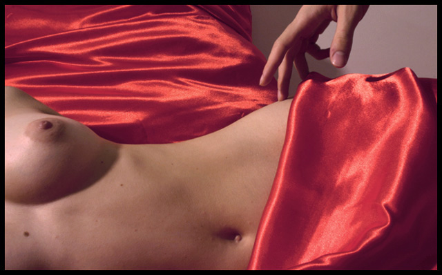
I like the idea, the lighting is a bit off though, the breasts have more lighting than the waist and gives it an unbalance lighting which also casts a shadow from her breasts. a suggestion I have...dare i say it is to crop off the breasts, i know i know i love that they are there but this shot will give it a mysterious and awesome look if it was only up to the waist. the background is also unbalanced a bit, there its half sheets and then a wall perhaps a flat background could have helped this shot as well.
|
|
Comments Made During the Challenge  |
|
|
11/01/2005 05:04:03 PM |
|
 Photographer found comment helpful. Photographer found comment helpful. |
|
|
10/31/2005 11:58:36 AM |
| OK, but I find the drape in the background distracting. |
|
| Photographer found comment helpful. |
|
|
10/30/2005 12:51:31 PM |
| Lovely photo...great color, nice light, sensual execution. |
|
| Photographer found comment helpful. |
|
|
10/30/2005 12:58:55 AM |
| the sheets look faded, and don't "bounce" out... the whole photo is rather bland, with some level editing in photoshop, the sheets would provide even more contrast with the subject.. |
|
| Photographer found comment helpful. |
|
|
10/29/2005 01:15:37 AM |
| This would be much better it you worked on your lighting a little. It is just to harsh and does not do "the nude" justice. A softer lights source with lots more shadow. |
|
| Photographer found comment helpful. |
|
|
10/28/2005 10:29:43 AM |
| This is nice in composition but the lights/hot spots are distracting and the highlights on the red satin seem either oversaturated or too reflective from the lighting. Also, red doesn't evoke a "delicate" feel. It's more seductive. This whole photo has a "come hither" feel to it, which is far from delicate! It would have been better, IMHO, if you would have used lighterfabrics with a gossimier sheen or laces. Nice work. |
|
| Photographer found comment helpful. |
|
|
10/28/2005 04:32:38 AM |
|
| Photographer found comment helpful. |
|
|
10/27/2005 03:00:45 PM |
|
| Photographer found comment helpful. |
|
|
10/27/2005 09:38:05 AM |
This is a great composition, the lighting is just a little off. I wish I was better at lighting so I could tell you what I don't like about it. I think I'd rather see this with a higher contrast - so the background as black, the shadows darker, more highlight on the hand.
But I love the curves, the highlights in the satin, the arch of the hand. This is very nice work 7 |
|
| Photographer found comment helpful. |
|
|
10/26/2005 11:48:07 PM |
| Nice colors, great lighting and composition, will be in the top 20 unless nudity-offended people votes it low .. 9 |
|
| Photographer found comment helpful. |
|
|
10/26/2005 07:16:50 PM |
| composition is really nice. I have the urge to hit the sharpen tool. |
|
| Photographer found comment helpful. |
|
|
10/26/2005 06:16:10 PM |
lighting seems a bit flat
|
|
| Photographer found comment helpful. |
|
|
10/26/2005 11:38:09 AM |
| nice composition, a bit more contrast and sharpness might make it look better.. |
|
| Photographer found comment helpful. |
|
|
10/26/2005 01:35:33 AM |
| great shot. i'd like to see it with a tiny bit more contrast. but i still love it! |
|
| Photographer found comment helpful. |
Home -
Challenges -
Community -
League -
Photos -
Cameras -
Lenses -
Learn -
Help -
Terms of Use -
Privacy -
Top ^
DPChallenge, and website content and design, Copyright © 2001-2025 Challenging Technologies, LLC.
All digital photo copyrights belong to the photographers and may not be used without permission.
Current Server Time: 03/12/2025 04:35:44 PM EDT.