| Author | Thread |
|
|
06/24/2002 12:16:00 AM |
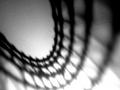
| I did try this as a crisp black on white, but it wasn't very interesting. The softer outline, color, and noise were all artistic decisions rather than accidents. It wasn't going to be a realistic type shot anyway, but we obviously all have different ideas of how a shot SHOULD be :o) Thanks for voting. |
|
Comments Made During the Challenge  |
|
|
06/23/2002 11:30:00 PM |
| this is a good attempt. the shadow is a little too soft, i think, and the picture is very grainy. the underexposed bottom is also a little distracting. a nice pose and a good crop, though. i like the blue hues to this, but maybe a black and white version might look better. |
|
 Photographer found comment helpful. Photographer found comment helpful. |
|
|
06/23/2002 10:04:00 PM |
| very interesting texture. |
|
|
|
06/23/2002 06:23:00 PM |
| Nicea idea, the framing is good... but the shadow isn't as crisp as it should be. |
|
| Photographer found comment helpful. |
|
|
06/20/2002 03:56:00 PM |
| get a breast enlargment, then try again please. Thank you. |
|
|
|
06/20/2002 12:01:00 PM |
| Interesting profile! I'm not sure if this is grain or if it's the surface on which the shadow is cast... Maybe a little adjustments on the levels would improve that somewhat... good shot! - jmsetzler |
|
| Photographer found comment helpful. |
|
|
06/19/2002 11:28:00 AM |
| Too much graininess...i'm not sure if you were looking for this effect. If so, you definitely achieved it! |
|
|
|
06/18/2002 08:38:00 PM |
| I really like your framing and texture |
|
| Photographer found comment helpful. |
|
|
06/18/2002 01:00:00 AM |
| Holy, put on some clothes. |
|
|
|
06/17/2002 09:44:00 PM |
| This is a nice photo. What was used for the back drop? |
|
| Photographer found comment helpful. |
|
|
06/17/2002 05:45:00 PM |
| NIce lighting, I'm not sure I understand the graininess though. Still, well framed and a goos dcore. |
|
| Photographer found comment helpful. |
|
|
06/17/2002 04:25:00 PM |
| very similar to an idea I had. |
|
|
|
06/17/2002 03:16:00 PM |
|
|
|
06/17/2002 01:24:00 PM |
| Nice curves, but the photo seems a bit grainy. |
|
|
|
06/17/2002 12:51:00 PM |
Very nice. I like how the color gradiates up the frame, but to pick nit, I would have like the upper arm to continue this vein. You are going to get grain comments, don't let them bother you. In this case, you get a bespeckled look that others would have to achieve in Photoshop. The grain is very consistant and reminds me of the painting style (can't remember the name) that was popular at the turn of the century, using paint dots, you know.
Photo 8 Creativity 7 Shadows 9 total 8 |
|
| Photographer found comment helpful. |
Home -
Challenges -
Community -
League -
Photos -
Cameras -
Lenses -
Learn -
Help -
Terms of Use -
Privacy -
Top ^
DPChallenge, and website content and design, Copyright © 2001-2025 Challenging Technologies, LLC.
All digital photo copyrights belong to the photographers and may not be used without permission.
Current Server Time: 03/12/2025 07:00:44 PM EDT.