| Author | Thread |
|
|
11/11/2005 11:49:18 PM |
::: Critique Club :::
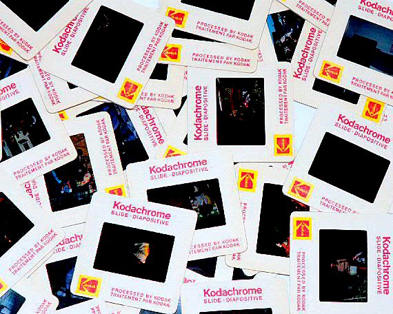
Well, this takes us back a bit doesn't it. Yes, by definition a slide is made with transparency film. What a hassle it used to be getting out the viewer and/or the projector just to admire your work.
First Impression - the most important one:
The first impression for those who've been there is a nice bit of nostalgia. For those that aren't familiar with slides, it would be a bit puzzling. The image doesn't have a dramatic impact, more of an editorial interest. There's not a hook of some sough there to draw you into the picture a little more.
Composition:
This composition of piles of slides certainly conveys the volume of slides that we acccumulate and also how hard they were to view. Such a busy layout poses a problem for the viewer - they don't know where to look. All thse composition rules might sound silly but they are about the way in which people react to an image, any image. So using the 'rules' of Thirds and Leading Lines can and do make a difference. Google them, there's lots of good informationa and discussions on the net.
Subject:
You are spot on the challenge subject, in fact more so than 90% of the entries because you have found a literal transparency and shown it well. So it's probably a surprise that so many voters didn't get it.
The apparent subject in this image as presented is busy nostalgia when in reality though, the story you wanted to convey was about the transpaerncy film as a genre. So what's needed to do that? I would think less slides probably, a layout that was part of the story and a way in which you can see the film's transparent properties.
Technical (Colour and light):
It's sharp and perfectly exposed but the lighting is where it could have really shone but didn't. You need backlight. As the commenters said too, just some light coming through the film would make all the difference. You have the perfect subject but it needs backlight to show it off.
Ok, how do you do that? Someone mentioned a 'light table'. Now most homes don't have such a thing. Why would you, but you can make one. If you have a piece of glass anywhere in the house, you've got a light table. There's glass in the most unlikely places like a china cabinet. Lift a door or shelf out and lie it flat on a few books to give you some space under it, put tissue or paper under it with a light = light table.
To get a Ribbon?:
Drama and impact get votes. Anything that generates an emotive reaction will attract people to spend a little longer looking at the image. If it makes them smile, gasp or cringe doesn't matter - any of those are better than no reaction at all.
Summary:
I think you have a very very strong idea here and its a pity that for technical reasons it didn't come off as well as you hoped.
It's hard to know what the wow factor could have been without experimanting. Certainly the lighting is important but over and above that it would need something else. That might be in the selection of the slides and some of the slly images they have on them. Perhaps it might have been just one slide with a poignant image in it and very soft gold light just illuminating the cardboard slide frame.
Such puzzles are certainly the fun of the challenges and I see that you have entered many with really good ideas. Looking at your portfolio I would suggest working on three areas - simplicity (less is more), composition and low angle lighting. See how you go, look forward to seeing the results :)
Brett
|
|
Comments Made During the Challenge  |
|
|
11/06/2005 11:54:18 PM |
Returning for comments:
What an era. |
|
|
|
11/05/2005 11:26:50 PM |
| ...they give us the nice bright colors, the greens of summer...makes you think all the world's a sunny day....oh yeah... |
|
|
|
11/05/2005 10:05:25 AM |
| Sharp focus and great Kodak color.....very creative take on the challenge. Well done. |
|
 Photographer found comment helpful. Photographer found comment helpful. |
|
|
11/04/2005 11:58:14 PM |
| Too much post processing or JPEG compression artifacting or something. The edges of the slides are very jagged, and the lighting seems overdone. Would have been better if you had less light on the front, and more from the back. |
|
| Photographer found comment helpful. |
|
|
11/04/2005 06:07:15 PM |
| literally speaking--good choice--nice title too. Somehow, I'd like to see these on a "light table" having light shown through them. |
|
| Photographer found comment helpful. |
|
|
11/03/2005 10:28:51 AM |
| Ok. Very literally taken. LOL.... |
|
|
|
11/01/2005 11:24:12 PM |
| you are a victim of jaggies. The subject is not bad, but not super either. Neutral score. |
|
| Photographer found comment helpful. |
|
|
11/01/2005 03:56:32 PM |
| yep, they are transparencies--literally. Interesting and unique capture and the title is so relevant. |
|
|
|
11/01/2005 02:30:11 PM |
| This image looks a little noisy and over-processed to me. Is that a function of compression ? |
|
| Photographer found comment helpful. |
|
|
10/31/2005 07:48:25 PM |
wow...i haven't looked at slides in forever! great idea for this challenge, but the effect ends up being the slides as objects instead of slides as transparancies, imo...
great photo idea, nicely executed... |
|
|
|
10/31/2005 12:33:13 AM |
| I know they are transparent.. but they dont show up as transparent displayed like this... I think this could be far more creatively set up (perhaps stacked with a light in the center to expose some of the images transparency?) .. just me and my warped sense of creativity.. and a bit sharper... awesome potential |
|
| Photographer found comment helpful. |
Home -
Challenges -
Community -
League -
Photos -
Cameras -
Lenses -
Learn -
Help -
Terms of Use -
Privacy -
Top ^
DPChallenge, and website content and design, Copyright © 2001-2025 Challenging Technologies, LLC.
All digital photo copyrights belong to the photographers and may not be used without permission.
Current Server Time: 03/12/2025 03:11:10 AM EDT.