| Author | Thread |
Comments Made During the Challenge  |
|
|
06/26/2003 10:05:40 PM |
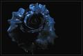
| good lighting, not so interesting sub ject. good framing. would rather a more subtle color in the border. 6. |
|
|
|
06/25/2003 08:19:45 PM |
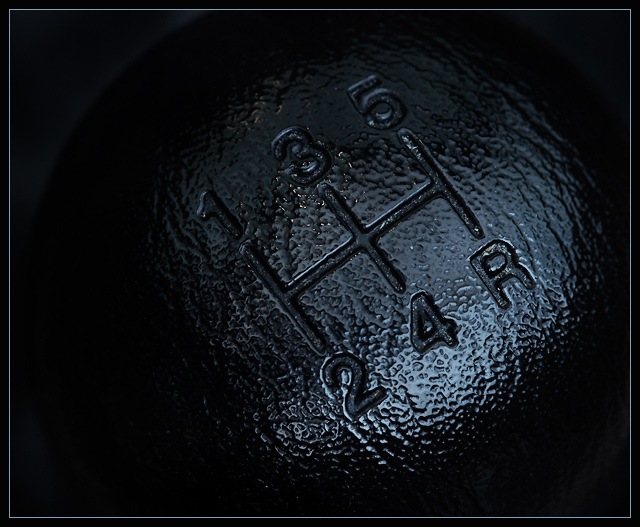
| Good job with just enough light to do the job. |
|
|
|
06/24/2003 06:42:13 AM |
This is my personal favorite this week. It is simple yet effective. My only criticism would be thelight section in the top left. I would have made this either lighter or darker. So either more obvious or get rid of it all together. Great shot though.
Good Luck, Todd. |
|
|
|
06/21/2003 02:30:21 AM |
| Nice that you thought of this. I was hoping that someone would. You did well with it, too. |
|
|
|
06/21/2003 12:47:52 AM |
| Lighting couldn't be any better, could it? It makes this inocuous object interesting! |
|
|
|
06/20/2003 03:42:11 PM |
| Nice and detailed macro work that really draws the eye but IMHO I would have preferred the area around to have been completely dark - 7 |
|
|
|
06/20/2003 03:36:38 PM |
| Excellent detail, sharp focus, very low key. Well done! |
|
Home -
Challenges -
Community -
League -
Photos -
Cameras -
Lenses -
Learn -
Help -
Terms of Use -
Privacy -
Top ^
DPChallenge, and website content and design, Copyright © 2001-2025 Challenging Technologies, LLC.
All digital photo copyrights belong to the photographers and may not be used without permission.
Current Server Time: 03/12/2025 02:48:16 AM EDT.