| Author | Thread |
|
|
11/20/2005 12:27:42 PM |
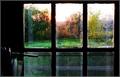
there is a wonderful gentleness to this shot..it feels like a shot that would read better bigger..and in print..nice choice not boosting saturation/contrast levels up too high..by the way I think you might want to check the comment "serene" as helpful, if only because it is accurate in my mind, and really is a great description of what you have caught..this is found in the combination of colour and tone..
this is the perfect example of a wonderful shot that would never do well on this site, but stands out on its own.. |
|
 Photographer found comment helpful. Photographer found comment helpful. |
Comments Made During the Challenge  |
|
|
11/15/2005 03:47:10 PM |
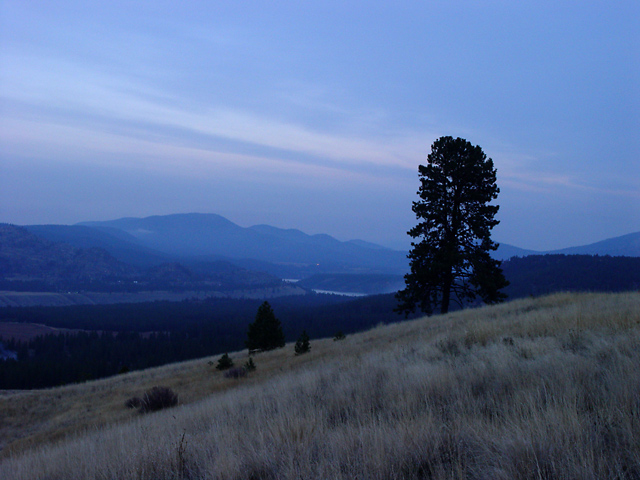
| nicely done, I like the layers |
|
| Photographer found comment helpful. |
|
|
11/13/2005 07:23:12 PM |
| I love the color cast in the shoot. It give a very peacfull meaning. Great job |
|
| Photographer found comment helpful. |
|
|
11/13/2005 05:40:04 PM |
|
| Photographer found comment helpful. |
|
|
11/11/2005 06:37:54 PM |
|
|
|
11/09/2005 11:44:09 PM |
| I love this photo, reminds me of van gogh, and the title is perfect! |
|
| Photographer found comment helpful. |
|
|
11/09/2005 12:24:48 PM |
| I really like the upper half of this picture but I feel the lower half is somewhat lacking. I think it would be better to crop the lowermost quarter or so off the image. Slightly above the lowest black bush/rock. |
|
| Photographer found comment helpful. |
Home -
Challenges -
Community -
League -
Photos -
Cameras -
Lenses -
Learn -
Help -
Terms of Use -
Privacy -
Top ^
DPChallenge, and website content and design, Copyright © 2001-2025 Challenging Technologies, LLC.
All digital photo copyrights belong to the photographers and may not be used without permission.
Current Server Time: 03/12/2025 10:02:03 AM EDT.