| Author | Thread |
Comments Made During the Challenge  |
|
|
11/12/2005 11:41:53 PM |
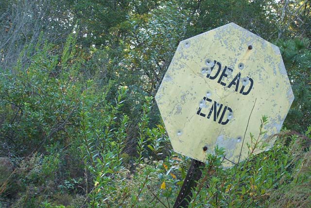
| A leaning sign would be nice, but leaning landscape loses it. IMHO. Also, try increasing contrast or applying levels to give more dramatic effect. |
|
 Photographer found comment helpful. Photographer found comment helpful. |
|
|
11/11/2005 12:35:40 AM |
| looks a little washed out, but nice concept |
|
| Photographer found comment helpful. |
|
|
11/09/2005 09:47:50 AM |
| This shot would have been better if it had more contrast and you had adjusted the color as it has a distinct Cyan cast. |
|
| Photographer found comment helpful. |
|
|
11/08/2005 10:23:32 PM |
| Fits the challenge but is washed out and dull |
|
| Photographer found comment helpful. |
|
|
11/08/2005 02:26:30 PM |
| This image is very flat. There is nothing that jumps out and says 'look at me'. |
|
| Photographer found comment helpful. |
|
|
11/07/2005 10:10:39 AM |
| The diagonal orientation doesn't do much for me in this case. Colors look washed out. I really like the sign. I think this would have been better with some work on the color. |
|
| Photographer found comment helpful. |
|
|
11/07/2005 02:10:09 AM |
| why the tilt? could have been cropped and edited better. |
|
| Photographer found comment helpful. |
|
|
11/07/2005 01:17:42 AM |
The low saturation on the sign contrasts too strongly with the relatively lush looking vegetation. Since this was an advanced editing challenge you might have tried masking the sign, inverting the selection and burning the background, then hue shifting the color of the sign toward a rusty red.
|
|
| Photographer found comment helpful. |
|
|
11/07/2005 01:01:49 AM |
| needs a bit more contrast :0) |
|
| Photographer found comment helpful. |
|
|
11/07/2005 12:17:53 AM |
| This has great potential with some post editing. I'd either adjust curves, or go black and white with lots of contrast. |
|
| Photographer found comment helpful. |
Home -
Challenges -
Community -
League -
Photos -
Cameras -
Lenses -
Learn -
Help -
Terms of Use -
Privacy -
Top ^
DPChallenge, and website content and design, Copyright © 2001-2025 Challenging Technologies, LLC.
All digital photo copyrights belong to the photographers and may not be used without permission.
Current Server Time: 03/13/2025 06:41:58 AM EDT.