| Author | Thread |
|
|
10/23/2006 07:48:45 AM |
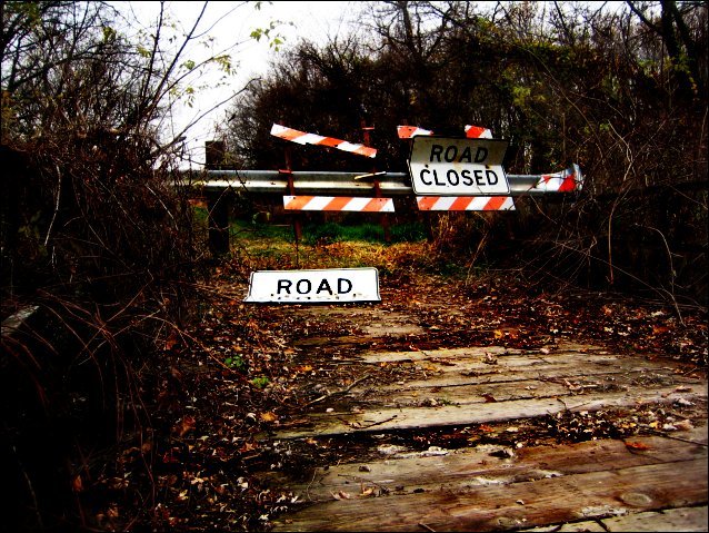
| I agree the picture is saturated. I however thought it was supposed to be that way. The combination of the Road Closed signs, the broken state of the sign on the left and the over all dark tone all add to the idea of this area being long forgotten. I personally like it. Great job. |
|
 Photographer found comment helpful. Photographer found comment helpful. |
Comments Made During the Challenge  |
|
|
11/11/2005 09:06:50 PM |
| 7 - Good fit for the Challenge. |
|
| Photographer found comment helpful. |
|
|
11/11/2005 12:29:58 AM |
| good picture with good sharpness |
|
| Photographer found comment helpful. |
|
|
11/08/2005 10:03:56 PM |
| Fits the challenge but not pleasant to the eye. |
|
|
|
11/08/2005 12:03:56 PM |
| I think there's a bit too much saturation under the "CLOSED" sign, and that the sides of the photo are a bit too dark. |
|
| Photographer found comment helpful. |
|
|
11/07/2005 06:09:26 PM |
| There's something about this that really appeals to me. Maybe its the contrast between the obvious "dead end" and accompanying dead brush, and the pretty fall colors. I think you've also done a great job editing. Good luck! |
|
| Photographer found comment helpful. |
|
|
11/07/2005 03:53:16 PM |
| What a great find. I was searching for something along the same lines for my shot. Congrats. Love the composition and the color. Well done. |
|
| Photographer found comment helpful. |
|
|
11/07/2005 02:11:54 AM |
| a bit over processed IMHO |
|
| Photographer found comment helpful. |
Home -
Challenges -
Community -
League -
Photos -
Cameras -
Lenses -
Learn -
Help -
Terms of Use -
Privacy -
Top ^
DPChallenge, and website content and design, Copyright © 2001-2025 Challenging Technologies, LLC.
All digital photo copyrights belong to the photographers and may not be used without permission.
Current Server Time: 03/17/2025 09:54:24 AM EDT.