| Author | Thread |
|
|
11/18/2005 04:04:00 PM |
Hello from the Critique Club!
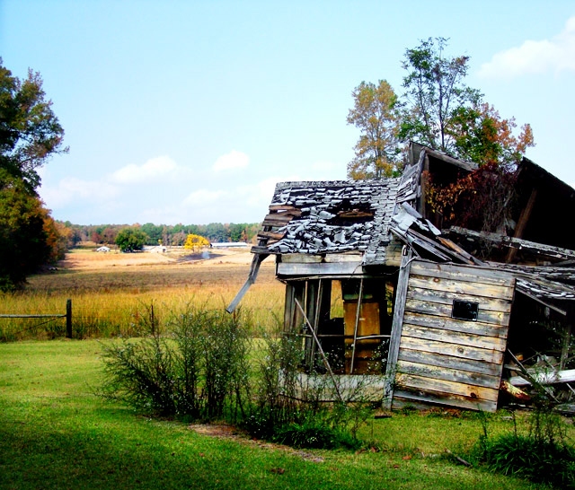
The first thing that struck me about this image is the beautiful colours of the house and the field behind. I love the saturation.
It fits the challenge very well (to me), and as I said, I enjoy the colours; though it might also make a striking black and white, this way it has an individual character.
I think that the sky is a bit overbright, it steals away some of the focus that could otherwise be on the house.
The focus/sharpness is really good, though I did notice that along the bars of the window, the lines look a bit choppy. Perhaps by using a larger aperature, for more depth, this could be avoided.
For composition, again, the sky is stealing focus away from the theme of your image. The top centimeter or so is only sky, and does not need to be included in the image... I'd suggest cropping off a bit of the top, and then maybe fiddling with cropping on the bottom and sides, to put better focus on the house.
Two other little things I noticed are:
- the right side of the house is dark and empty, which distracts me from the busy dissaray beautifully portrayed in the left.
- along with the right side of the house, there are four dark areas, all along the side -- the grass bunch, the shadow in the grass, and the tree... While they aren't all really distractions, I find that they do not add to the photo as a whole. (Which is why I suggested playing with the cropping along the sides and bottom as well.)
Congrats on the score, and good luck in all future challenges!
--Mariana (funnylooks)
Feel free to PM me with any questions/comments. |
|
 Photographer found comment helpful. Photographer found comment helpful. |
Comments Made During the Challenge  |
|
|
11/13/2005 10:58:51 PM |
| Great great shot! If it was free study I would give a 10. I wish I could lump in to the dead end theme but I can't. 7 |
|
| Photographer found comment helpful. |
|
|
11/13/2005 12:48:31 PM |
| Great eye!! You've taken an image and made it into a story all it's own. The only thing I wish was done differently was a bit more of the house/cabin and less of the pond and trail behind. There might have been a reason you cut off the building...I have to imagine there was. Great image. --8-- |
|
| Photographer found comment helpful. |
|
|
11/12/2005 06:55:28 PM |
| good idea for a photo. I wonder if a black and white would create more of a 'dead end' feel to the photo. The vibrant colors seem to take away from the mood of the interesting house. Nice texture on the house by the way! |
|
| Photographer found comment helpful. |
|
|
11/11/2005 09:26:04 PM |
| this is a beautiful photo and it looks as it is the end for this place |
|
| Photographer found comment helpful. |
|
|
11/11/2005 02:22:57 AM |
| Good shot, maybe a tighter crop or framing of the subject as the background on the left adds nothing to the shot. |
|
| Photographer found comment helpful. |
|
|
11/10/2005 07:59:20 PM |
|
| Photographer found comment helpful. |
|
|
11/09/2005 01:20:30 AM |
| I like the old town down house. The grass looks freshly mowed though which makes it look unreal. The color of the lawn looks a bit fake. With all the dried brown grass around it, it looks as though someone was watering this lawn but for what purpose. The composition is good. |
|
| Photographer found comment helpful. |
|
|
11/08/2005 11:58:02 PM |
|
| Photographer found comment helpful. |
|
|
11/08/2005 01:34:20 PM |
|
| Photographer found comment helpful. |
|
|
11/07/2005 01:58:25 PM |
| I think this would have made more of a statement in b&w. |
|
| Photographer found comment helpful. |
|
|
11/07/2005 01:12:44 PM |
| Nice photo, with a good mood, to suit the theme. I think I would have preferred the horizon to be a little higher, at the junction of thirds, with a bit less sky, which is too bright for the rest of the pic. |
|
| Photographer found comment helpful. |
|
|
11/07/2005 02:18:06 AM |
| a bit over processed IMHO |
|
| Photographer found comment helpful. |
|
|
11/07/2005 12:41:24 AM |
| This looks over-processed. The green doesn't look natural. |
|
| Photographer found comment helpful. |
Home -
Challenges -
Community -
League -
Photos -
Cameras -
Lenses -
Learn -
Help -
Terms of Use -
Privacy -
Top ^
DPChallenge, and website content and design, Copyright © 2001-2025 Challenging Technologies, LLC.
All digital photo copyrights belong to the photographers and may not be used without permission.
Current Server Time: 03/17/2025 02:40:50 AM EDT.