| Author | Thread |
|
|
06/27/2003 08:42:55 AM |
Critique Club
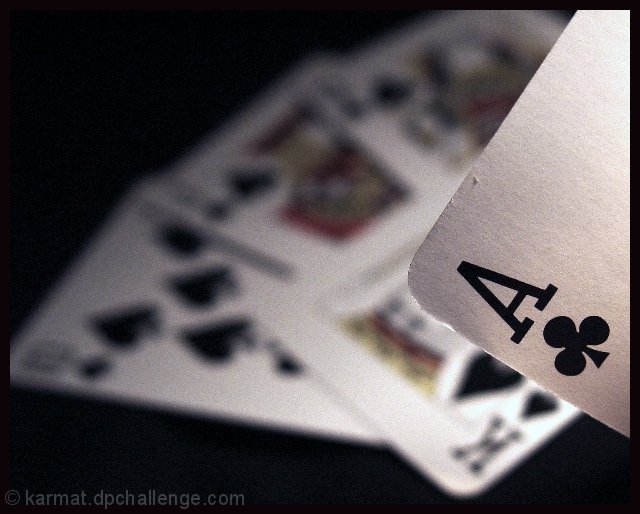
If that one card I can't make out is a Q you got a great hand there. If you are playing poker I'm glad I'm not at the table =o) The dof used here works nicely, the focus is very good but what I don't like is there is just a little bit to much light for this challenge and not enough shadowing. Nice composition and yeah even with to much light it still is obvious it was done in low light so it does meet the challenge.
Anna
|
|
 Photographer found comment helpful. Photographer found comment helpful. |
Comments Made During the Challenge  |
|
|
06/26/2003 10:21:13 PM |
| good depth of field, but i almost feel like the background cards are just cluttering this up. the black of the lettering on the card would probably look great when coupled with the complete black of the background, but you've thrown a lot of other whites and colors in there and it seems to just clutter it. 5. |
|
| Photographer found comment helpful. |
|
|
06/25/2003 08:43:42 AM |
| Nice detail and composition. |
|
| Photographer found comment helpful. |
|
|
06/24/2003 10:05:32 PM |
Very cool. I like this a lot. I think the dented Ace gives the picture character. Possibly the back upper cards a bit too out of focus, but i like very much.
|
|
| Photographer found comment helpful. |
|
|
06/23/2003 06:21:13 PM |
|
|
|
06/23/2003 12:50:43 PM |
| neat idea but it would be a great pic if the other cards were in a little better focus good luck in placing. |
|
| Photographer found comment helpful. |
|
|
06/22/2003 03:48:06 AM |
|
| Photographer found comment helpful. |
|
|
06/22/2003 02:59:27 AM |
| At first I didn't feel this met the challenge, but now, what the heck, it's dark, right? And I just love this shot: composition, focus especially. Nice work. 9 |
|
| Photographer found comment helpful. |
|
|
06/21/2003 06:19:20 PM |
| a clever interpretation of the challenge! Well and (so far) uniquely done! |
|
| Photographer found comment helpful. |
|
|
06/21/2003 12:25:28 AM |
| great depth of field & composition... |
|
| Photographer found comment helpful. |
|
|
06/20/2003 03:26:56 PM |
| Like this - the blur makes it - 8 |
|
| Photographer found comment helpful. |
|
|
06/20/2003 01:13:49 PM |
| Too bright overall for me to give it my best mark, I'm afraid. |
|
| Photographer found comment helpful. |
|
|
06/20/2003 12:06:00 AM |
| Nice dof used, definately pulls the Ace out as your subject. |
|
| Photographer found comment helpful. |
Home -
Challenges -
Community -
League -
Photos -
Cameras -
Lenses -
Learn -
Help -
Terms of Use -
Privacy -
Top ^
DPChallenge, and website content and design, Copyright © 2001-2025 Challenging Technologies, LLC.
All digital photo copyrights belong to the photographers and may not be used without permission.
Current Server Time: 03/12/2025 06:07:22 PM EDT.