| Author | Thread |
Comments Made During the Challenge  |
|
|
11/15/2005 04:42:47 PM |
|
 Photographer found comment helpful. Photographer found comment helpful. |
|
|
11/12/2005 03:40:14 PM |
| this looks really cool, i liked the depth.. |
|
| Photographer found comment helpful. |
|
|
11/11/2005 11:07:47 PM |
|
| Photographer found comment helpful. |
|
|
11/11/2005 10:48:41 PM |
There is something i really like about this photo but dont really know what it is.
But i like it a lot:) |
|
| Photographer found comment helpful. |
|
|
11/11/2005 08:57:43 PM |
nice colors and composition.... well done
|
|
| Photographer found comment helpful. |
|
|
11/11/2005 08:09:28 AM |
|
| Photographer found comment helpful. |
|
|
11/10/2005 04:14:35 PM |
| This is just beautiful. the composition, the sharpness. You did an amazing job. It's just very appealing to look at! |
|
| Photographer found comment helpful. |
|
|
11/10/2005 03:17:46 PM |
|
| Photographer found comment helpful. |
|
|
11/10/2005 02:59:25 PM |
| wow, very clear and crisp picture. great lighting too. excellent job! |
|
| Photographer found comment helpful. |
|
|
11/10/2005 01:22:04 PM |
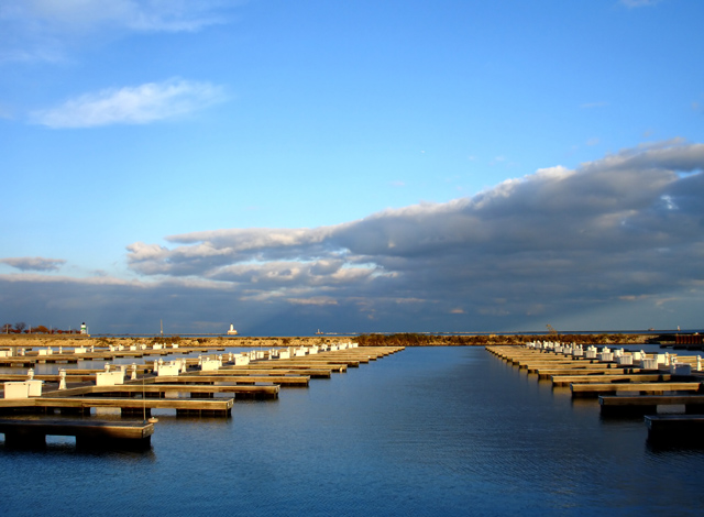
| I really like the huge depth of field in this photo, and the patterns that the docks make. The clouds in the sky somehow look pretty unnatural to me, but I can't quite put my finger on why. Overall a really nice photo for this challenge. |
|
| Photographer found comment helpful. |
|
|
11/09/2005 10:19:43 PM |
| 7 - Very nice. Criticism; not much and difficult as I don't know 'what is there' either side, but perhaps a different crop, especially with less sky, may have made this even better in my opinion. Like the 'straight lines' in the docks and far 'land'/causeway. |
|
| Photographer found comment helpful. |
|
|
11/09/2005 08:49:51 PM |
| Interesting shot. I think it might work better with more sky cropped out. It would give the repetition in the docks(?) more punch. As is, the sky dominates the frame, but it's much less interesting than what's below it. |
|
| Photographer found comment helpful. |
|
|
11/09/2005 01:56:24 PM |
| I love this shot. Though I'm by far not an expert I would maybe suggest cutting out maybe a quarter of the picture on top, even though it may go against the rule of thirds, but speaking of that rule of thumb it seems to be in effect vertically too. I still like it a lot as it is though. |
|
| Photographer found comment helpful. |
Home -
Challenges -
Community -
League -
Photos -
Cameras -
Lenses -
Learn -
Help -
Terms of Use -
Privacy -
Top ^
DPChallenge, and website content and design, Copyright © 2001-2025 Challenging Technologies, LLC.
All digital photo copyrights belong to the photographers and may not be used without permission.
Current Server Time: 04/29/2025 01:24:04 PM EDT.