| Author | Thread |
|
|
11/16/2005 03:08:33 PM |
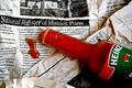
| It just looks too nice for garbage. The lighting is wonderful. I need to make my own lightbox someday too. But it all looks too staged and antiseptic. I think that's your biggest problem. The composition isn't bad, but is too symmetrical and centered. We have 4 elements all mirroring each other. That adds to the unrealistic nature. I think we wanted our garbage to look like garbage...(see ribbon winners). |
|
 Photographer found comment helpful. Photographer found comment helpful. |
Comments Made During the Challenge  |
|
|
11/15/2005 01:11:21 PM |
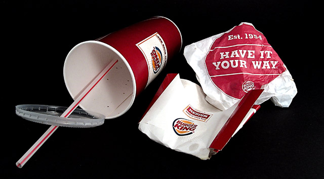
| Reasonable composition and color contrast, slogan might be better some degrees clockwise? |
|
| Photographer found comment helpful. |
|
|
11/15/2005 10:25:29 AM |
| Good color and composition. |
|
| Photographer found comment helpful. |
|
|
11/13/2005 06:56:17 PM |
| Nice composition and colors |
|
| Photographer found comment helpful. |
|
|
11/11/2005 12:49:00 PM |
| good title and excellent quality, certainly meets challenge - good job :) |
|
| Photographer found comment helpful. |
|
|
11/10/2005 06:48:53 PM |
like the contrast amongst black, white and red. would like to see just a bit more black at the top and bottom for greater image balance. it also appears that the black in the lower right corner is deteriorating just a bit, which is distracting.
i like this image very much, it's one of my favorites so far for this challenge. |
|
| Photographer found comment helpful. |
Home -
Challenges -
Community -
League -
Photos -
Cameras -
Lenses -
Learn -
Help -
Terms of Use -
Privacy -
Top ^
DPChallenge, and website content and design, Copyright © 2001-2025 Challenging Technologies, LLC.
All digital photo copyrights belong to the photographers and may not be used without permission.
Current Server Time: 03/14/2025 06:21:21 AM EDT.