| Author | Thread |
Comments Made During the Challenge  |
|
|
11/15/2005 11:27:09 AM |
| Has fall colors, but a broader spectrum might be more interesting. |
|
|
|
11/13/2005 06:50:24 PM |
|
|
|
11/11/2005 08:30:31 PM |
| Nice and colourful, but it seems over sharpened or over saturated. |
|
|
|
11/10/2005 06:57:41 PM |
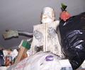
| oooh...makes my stomach hurt from the memory of all that candy! like how the silver hershey wrapper catches the light. |
|
|
|
11/10/2005 01:57:01 PM |
| I feel that this has a bit of a reddish-orange colour cast to it, but that could just be my tired eyes. Strangely enough, I like the composition. |
|
|
|
11/09/2005 11:39:02 PM |
| great idea. the colours seem to have a yellow cast, however. i like it though. |
|
|
|
11/09/2005 03:48:08 PM |
| The appearance of the lower left of the Hershey label is strange. perhaps the lighting is too harsh or it has been very oversharpened. Also needs more DOF -- wrapper in foreground, bottom-right is out of focus. Perhaps image was oversharpened to attempt to make up for focus? |
|
|
|
11/09/2005 02:47:26 PM |
|
Home -
Challenges -
Community -
League -
Photos -
Cameras -
Lenses -
Learn -
Help -
Terms of Use -
Privacy -
Top ^
DPChallenge, and website content and design, Copyright © 2001-2025 Challenging Technologies, LLC.
All digital photo copyrights belong to the photographers and may not be used without permission.
Current Server Time: 03/12/2025 07:35:53 AM EDT.