| Author | Thread |
|
|
11/27/2005 12:36:36 AM |
*Critique Club*
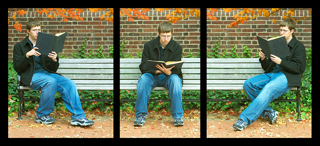
Cool idea, I like the college look. One thing that was interesting I find is how the border really makes his shirt and book look gray, was it a black shirt? I also wish the book was down just a couple more inches to see his face. I really like the include of the leaves it really gives you that "at school feel". I love how you took the time to make sure the bench look like it is connected and not 3 separate shots. I personally scored you higher then you placed. Good job.
|
|
 Photographer found comment helpful. Photographer found comment helpful. |
Comments Made During the Challenge  |
|
|
11/19/2005 05:40:26 AM |
| Perfectly lined up - gives a good illusion. Colours etc complement |
|
| Photographer found comment helpful. |
|
|
11/17/2005 11:38:41 PM |
|
|
|
11/17/2005 04:11:33 PM |
I love this shot.
the exposure is spot on for joining them together.
9
Good luck |
|
| Photographer found comment helpful. |
|
|
11/17/2005 10:11:19 AM |
|
| Photographer found comment helpful. |
|
|
11/14/2005 10:43:41 PM |
| i love the angles and the colors against each other, well done. 8 |
|
| Photographer found comment helpful. |
|
|
11/14/2005 07:28:10 PM |
| Great concept, great alignment - nicely done! |
|
| Photographer found comment helpful. |
|
|
11/14/2005 04:22:37 PM |
| Only complaint I have is that the book is blocking the subject's face in the two end shots. |
|
| Photographer found comment helpful. |
|
|
11/14/2005 06:18:11 AM |
| I only just noticed the loooong bench. Well done. |
|
| Photographer found comment helpful. |
|
|
11/14/2005 12:45:43 AM |
| stellar job! good luck 10 |
|
| Photographer found comment helpful. |
Home -
Challenges -
Community -
League -
Photos -
Cameras -
Lenses -
Learn -
Help -
Terms of Use -
Privacy -
Top ^
DPChallenge, and website content and design, Copyright © 2001-2025 Challenging Technologies, LLC.
All digital photo copyrights belong to the photographers and may not be used without permission.
Current Server Time: 04/01/2025 06:57:55 PM EDT.