| Author | Thread |
|
|
11/21/2005 12:57:38 PM |
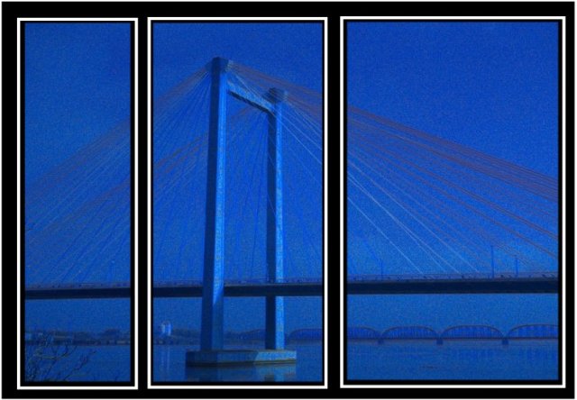
| i quite like the misty look of the diffused blue. i think that the harsh black and white makes it look like it should be sharper, but with simpler borders, this would flow very well! |
|
 Photographer found comment helpful. Photographer found comment helpful. |
Comments Made During the Challenge  |
|
|
11/20/2005 11:27:36 AM |
| Nicely done--very good color effect and composition--this challenge is full of talented and creative shooters. |
|
| Photographer found comment helpful. |
|
|
11/18/2005 06:41:45 PM |
| Interestingly put together. I like the blue tones too. |
|
| Photographer found comment helpful. |
|
|
11/17/2005 10:08:12 AM |
| i think this might be better more focused and less noise |
|
| Photographer found comment helpful. |
|
|
11/16/2005 08:34:26 PM |
|
| Photographer found comment helpful. |
|
|
11/15/2005 07:44:56 PM |
| I think the glaring black and white borders detract from the shot quite a bit. A thinner and perhaps darker (gray rather than white) border would probably help to emphasize the shot. |
|
| Photographer found comment helpful. |
|
|
11/15/2005 02:19:05 PM |
| good "panes" of different size, the noise in the photo is a bit too much for my taste. |
|
| Photographer found comment helpful. |
|
|
11/15/2005 01:29:12 PM |
| I would like more focused and not so noisy image. Nice cool color. |
|
| Photographer found comment helpful. |
|
|
11/15/2005 12:27:50 PM |
| Hmmm, I can forgive the noise, but I think this would have been much better had the stays been in sharp relief. They would have countered the vertical frames nicely. I like the blue. 6 |
|
| Photographer found comment helpful. |
|
|
11/15/2005 11:27:38 AM |
| How does the division of your picture into three frames enhance the photo? How does this "tell...a story or illustrates a concept or object" better than the original image? |
|
| Photographer found comment helpful. |
|
|
11/15/2005 10:04:14 AM |
| I think the border is a bit heavyhanded. |
|
| Photographer found comment helpful. |
|
|
11/14/2005 08:35:44 PM |
| i like it, maybe without so much blue? 7. |
|
| Photographer found comment helpful. |
|
|
11/14/2005 07:19:23 PM |
| I like the concept, but the image is a little to blurry and noisey for me. Also, the pictures themselves are not aligned - the image on the left is lower then the middle and far right side. |
|
| Photographer found comment helpful. |
|
|
11/14/2005 04:06:15 PM |
| I think a sharper more defined picture would help. The borders should all be the same size. |
|
| Photographer found comment helpful. |
|
|
11/14/2005 12:26:24 PM |
| I'm curious to see how your submission goes down with the other voters, but I really like the gritty graphical quality of this. Very cool image. 10. |
|
| Photographer found comment helpful. |
|
|
11/14/2005 11:18:08 AM |
|
| Photographer found comment helpful. |
|
|
11/14/2005 11:10:40 AM |
| I know this meets the challenge, but I am not a big fan on just cutting up one nice shot into 3 with distracting borders. Seems too easy, no real creativity required. |
|
| Photographer found comment helpful. |
|
|
11/14/2005 12:40:58 AM |
| The heaviness of the white borders is killing this shot iMO |
|
| Photographer found comment helpful. |
|
|
11/14/2005 12:29:57 AM |
| I like the asymmetrical divisions. |
|
| Photographer found comment helpful. |
Home -
Challenges -
Community -
League -
Photos -
Cameras -
Lenses -
Learn -
Help -
Terms of Use -
Privacy -
Top ^
DPChallenge, and website content and design, Copyright © 2001-2025 Challenging Technologies, LLC.
All digital photo copyrights belong to the photographers and may not be used without permission.
Current Server Time: 03/12/2025 08:16:11 AM EDT.