| Author | Thread |
Comments Made During the Challenge  |
|
|
11/19/2005 09:32:53 PM |
| Large images to show the detail of the feathers would have been better |
|
 Photographer found comment helpful. Photographer found comment helpful. |
|
|
11/19/2005 02:31:26 PM |
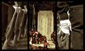
| This is one of the few thick, "fancy" frames that I really, really think adds to the whole composition. It doesn't hurt that your subjects are beautiful, though. The feather to the right is definitely the strongest, in my opinion. I was about to suggest that it might be nice with the center feather more centered. But on closer look, I see that its shadow contributes nicely. |
|
| Photographer found comment helpful. |
|
|
11/19/2005 05:14:04 AM |
| 3 very well executed shots...I would however like to see more equal tones in the background of the 2 color shots...the one on the left has a much deeper tone to it... but nice work. |
|
| Photographer found comment helpful. |
|
|
11/19/2005 01:36:53 AM |
| Really nice set-up of shapes and colors, shadows and gradients! Nice photoshop work with the subtle frames :) Bump UP |
|
| Photographer found comment helpful. |
|
|
11/17/2005 11:38:51 PM |
| Wow - beautiful detail and sense of lightness. Even your shadows in the borders supports the feel. |
|
| Photographer found comment helpful. |
|
|
11/17/2005 10:36:26 AM |
|
| Photographer found comment helpful. |
|
|
11/16/2005 09:51:55 PM |
| Now this is good. Creative, thematic, and interesting. Keep it up. |
|
| Photographer found comment helpful. |
|
|
11/15/2005 06:42:27 PM |
| Ohh the colors! I like it, to bad about the size, but yes, I know 640 restrictions.. |
|
| Photographer found comment helpful. |
|
|
11/14/2005 07:46:10 PM |
|
| Photographer found comment helpful. |
|
|
11/14/2005 07:22:32 PM |
| 6 - Nice. Good title. Criticism; not sure on the outer 'padding', does give a 3d type of effect but not sure it complements the 'light and delicate' nature of the 'set'. Middle shot not sure on, especially cropping, size and loss of color and detail - again though, likely looks quite different 'wall size'. Colors overall are nice, but would like to see all a little 'richer'. Similar detail in #3 as in #1 would also make this a better triptych in my opinion. |
|
| Photographer found comment helpful. |
|
|
11/14/2005 06:55:30 PM |
| very nice shots of the feathers, and colorful, but the framing is a little too gimmicky, it takes attention away from the images |
|
| Photographer found comment helpful. |
|
|
11/14/2005 03:26:45 PM |
| Great colors...I also like the white to grey faded background. |
|
| Photographer found comment helpful. |
|
|
11/14/2005 10:15:53 AM |
| I'd really have appreciated to have the central pictures more important..but I like the idea and the overall realisation |
|
| Photographer found comment helpful. |
|
|
11/14/2005 05:09:59 AM |
| I like the background "reverse gradients", and am interested in the optical illusion this creates, where the vertical spaces between the frames appear not be parallel, when they obviously are. I like the compilation very much, and the title! |
|
| Photographer found comment helpful. |
|
|
11/14/2005 12:46:23 AM |
| Great title!!! I like the gradation of the canvas tones. |
|
| Photographer found comment helpful. |
Home -
Challenges -
Community -
League -
Photos -
Cameras -
Lenses -
Learn -
Help -
Terms of Use -
Privacy -
Top ^
DPChallenge, and website content and design, Copyright © 2001-2025 Challenging Technologies, LLC.
All digital photo copyrights belong to the photographers and may not be used without permission.
Current Server Time: 03/31/2025 06:31:07 AM EDT.