| Author | Thread |
|
|
07/04/2003 04:31:11 PM |
FROM THE CRITIQUE CLUB
Hello,
First impression: Excellent entry for "At Work", it really gives the impression of someone working. The image looks a little bright to me - was that intentional?
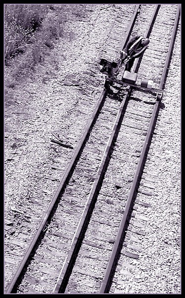
Composition: I very much like the diagonal lines throughout the photo. The tracks could have led the eyes out of the image, but the man and his machine at 90 degrees to the tracks keep the viewer nicely in the picture. Personally I like the crop, it seems to me that a closer crop would take away from the picture. I love the weeds to the top left. And, even though purple tones are not my favourites, I like them here. I like the small purple line surrounding the image, and heavy black border is right IMO.
Technical: The picture is well in focus, no problems there. Light, to my eyes it's a bit bright, as if you'd taken the picture right close to the middle of the day, and the sun was harsh. I really don't know if different light or taking the picture at a different time of the day would make it better or not, but it would be interesting to try.
Overall: I like this picture, it's a good entry to the challenge, and your score is quite good, but I don't think it's your best shot (duh!). Anyway - I really like your "Green Eyes" picture, and I don't have a pet or even like animals all that much (I'm scared of them!). Your work is original, very nice.
Take care,
Ursula (uabresch)
|
|
 Photographer found comment helpful. Photographer found comment helpful. |
Comments Made During the Challenge  |
|
|
06/29/2003 01:57:43 PM |
| I think the black border is a bit heavy but it matches the heavy shadows on the tracks. The perspective makes your subject look small and isolated, which really works for this shot. Nicely done. |
|
| Photographer found comment helpful. |
|
|
06/28/2003 10:25:56 PM |
| A little too much magenta in the toning. |
|
|
|
06/28/2003 12:26:54 AM |
| Very interesting - I do wish the crop had been tighter so we could see more of what's being done, though. |
|
|
|
06/27/2003 12:08:53 PM |
| I like the use of leading lines and negative space but the lighting is very bright and makes everything look washed out. |
|
|
|
06/27/2003 11:43:46 AM |
| Love the composition with a different shaped format. Seems a little "harsh". Maybe needs to be a little "softer" focus. |
|
|
|
06/27/2003 11:20:11 AM |
| Wow - striking composition and contrast though i'm thinking maybe straight monochrome would have looked better. I have a close up rail shot myself that seemed to lose something when i tried sepia and I feel this might suffer the same. Excellent effort all the same - 8 |
|
| Photographer found comment helpful. |
|
|
06/26/2003 08:38:17 PM |
|
|
|
06/25/2003 10:38:50 PM |
| Creates the sense of a very hot day in the sun and long, long way to go until quiting time. A composition to make the worker a little larger would have been better. |
|
| Photographer found comment helpful. |
|
|
06/25/2003 10:34:36 PM |
| Nice composition, but I really want to know what he is doing. Perhaps closer? . . . . . |
|
|
|
06/25/2003 07:00:15 PM |
| I like the composition and the idea but I am not sure what it is a picture of. I think the photo would have benefited by getting a bit closer to the subject. |
|
|
|
06/25/2003 03:02:47 PM |
| Excellent angle and "white space" takes you through this image. |
|
|
|
06/23/2003 08:09:52 AM |
| I think this is the best picture in this challenge 10pt |
|
Home -
Challenges -
Community -
League -
Photos -
Cameras -
Lenses -
Learn -
Help -
Terms of Use -
Privacy -
Top ^
DPChallenge, and website content and design, Copyright © 2001-2025 Challenging Technologies, LLC.
All digital photo copyrights belong to the photographers and may not be used without permission.
Current Server Time: 03/14/2025 02:19:46 PM EDT.