| Author | Thread |
Comments Made During the Challenge  |
|
|
11/19/2005 09:12:33 PM |
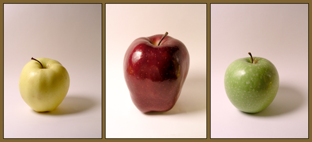
| The varying color backgrounds is going to take away from this image |
|
 Photographer found comment helpful. Photographer found comment helpful. |
|
|
11/18/2005 08:26:16 PM |
| I would have tried to get the light the same in all 3 shots...but not bad. |
|
| Photographer found comment helpful. |
|
|
11/18/2005 05:22:53 PM |
technically this has a lot of room for improvement... some things to consider -
- reducing the glare on the apple (soften the light source by putting a white bed sheet in the path of the light to diffuse it)
- remove the cast shadows (again this is a lighten problem, diffusing the light will help)
- brighten up the colors (can be done in post processing, lots and lots of ways to do it)
- inconsistent backdrops (it is white on the left side of the middle panel but warm grey elsewhere... for these type of shots a clean white backdrop is usually best)
Hope you dont take my comments the wrong way, just trying to be helpful and constructive. |
|
| Photographer found comment helpful. |
|
|
11/17/2005 10:06:06 AM |
| good shots, i think i would rather have the apples the same size, but that just might be me |
|
| Photographer found comment helpful. |
|
|
11/15/2005 10:56:20 PM |
| An interesting idea. A whiter background and a bit more contrast would have helped boost the image. |
|
| Photographer found comment helpful. |
|
|
11/14/2005 08:03:22 PM |
the color balance being off hurts on the backround hurts the group
|
|
| Photographer found comment helpful. |
|
|
11/14/2005 05:26:20 PM |
| 4 - Nice and 'soft', coloring and 'focus'. Criticism; whilst I think the frame color suits the background colors I am not sure it suits the subjects. Overall, while nice and 'clean', this lacks 'something' in my opinion, maybe just a richer coloring or uniform crop, may have made it better, not sure. |
|
| Photographer found comment helpful. |
|
|
11/14/2005 09:41:55 AM |
| i think consistency in the white background between these 3 pictures could have improved this one. nice pictures and nice idea. |
|
| Photographer found comment helpful. |
|
|
11/14/2005 03:15:13 AM |
| One of the few cases where a non-black or non-white border works. Great job. |
|
| Photographer found comment helpful. |
|
|
11/14/2005 01:28:20 AM |
|
| Photographer found comment helpful. |
Home -
Challenges -
Community -
League -
Photos -
Cameras -
Lenses -
Learn -
Help -
Terms of Use -
Privacy -
Top ^
DPChallenge, and website content and design, Copyright © 2001-2025 Challenging Technologies, LLC.
All digital photo copyrights belong to the photographers and may not be used without permission.
Current Server Time: 03/12/2025 02:52:22 AM EDT.