| Author | Thread |
Comments Made During the Challenge  |
|
|
11/22/2005 12:58:31 PM |
| Need better focus, off center lighting can help reduce glare as well as bring out shadow on the object. |
|
|
|
11/21/2005 01:46:27 PM |
| good idea....but not clear about subject....a little blurry..... |
|
|
|
11/20/2005 10:36:24 PM |
| I'm sure this is obvious, and maybe you did it on purpose, but...its blurry |
|
|
|
11/20/2005 06:20:20 PM |
| Looks like you tried this handheld, I would suggest a tripod for low lighting situations like this. The closet background also detracts from your subject, which is the guitar - a plain wall would have been a better background. |
|
|
|
11/20/2005 02:50:26 AM |
| it's too out of focus for me... |
|
|
|
11/19/2005 08:41:05 AM |
| blurry, out of focus, colors are like more desaturated |
|
|
|
11/19/2005 07:42:48 AM |
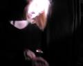
| Composition is good, I can see how the use of lines was intended to strengthen the imagery. I'm not sure the background works as well as you intended. Unfortunately, there are some blown-out spots on the guitar and also on the closet door. The lack of focus is severe here and (if intentional) doesn't work when considering the impact of the lines. This is a decent idea but the shot is technically weak with regard to exposure and focus, and those deficiencies will be hard to overcome. Better luck in the next challenge! |
|
|
|
11/19/2005 01:37:11 AM |
| Not enough focus, and Idon't like the background. |
|
|
|
11/18/2005 09:36:20 PM |
| I like the composition of the shot, but the bright glare on the guitar and it not being in focus pull the score down. |
|
|
|
11/18/2005 07:51:01 PM |
| I don't get the still life guitar stuff? Pick another subject. |
|
|
|
11/18/2005 11:57:15 AM |
| Images here need to be in focus to do well. |
|
|
|
11/17/2005 11:06:00 PM |
|
|
|
11/17/2005 05:54:21 PM |
| Subject is blurred, and the background distracts. |
|
|
|
11/17/2005 05:49:52 AM |
|
|
|
11/17/2005 01:57:10 AM |
too blurry, but angle is interesting
|
|
|
|
11/16/2005 07:24:05 PM |
|
|
|
11/16/2005 06:40:45 PM |
| Unfortunately, I cannot find a single point in focus. In low light settings such as this, it might be better to set the focus manually with a brighter light, then switch to this dimmer--and wonderfully moody--lighting. |
|
|
|
11/16/2005 05:43:26 PM |
| I'm not sure I can say anything about this. |
|
|
|
11/16/2005 04:15:08 PM |
| less blurriness might of made this a better picture... |
|
|
|
11/16/2005 02:43:09 PM |
| pretty cool angle. makes me a bit dizzy. overall good job. and good concept. |
|
|
|
11/16/2005 12:48:13 PM |
| A little blurry and not really the best choice of a background. |
|
|
|
11/16/2005 11:47:40 AM |
| Needs to have at least something in focus, try a tripod or bumping up ISO. |
|
|
|
11/16/2005 05:59:03 AM |
| Concept is good, and the different perspective was worth a try, but sadly this is too fuzzy - needs sharper focusing to work. |
|
|
|
11/16/2005 02:12:34 AM |
| looks like maybe you had some camera shake? |
|
|
|
11/16/2005 01:18:12 AM |
| You should use a tripod so you want get that movement making things look out of focus |
|
Home -
Challenges -
Community -
League -
Photos -
Cameras -
Lenses -
Learn -
Help -
Terms of Use -
Privacy -
Top ^
DPChallenge, and website content and design, Copyright © 2001-2025 Challenging Technologies, LLC.
All digital photo copyrights belong to the photographers and may not be used without permission.
Current Server Time: 03/13/2025 01:14:43 AM EDT.