| Author | Thread |
Comments Made During the Challenge  |
|
|
11/18/2005 04:22:58 AM |
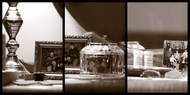
| Insufficient focus in the centre panel particularlyand the apparent misaligned photo between panels one and two is another distraction. |
|
 Photographer found comment helpful. Photographer found comment helpful. |
|
|
11/17/2005 11:15:20 PM |
a high f stop would have made this image more appealing to the viewer.
|
|
| Photographer found comment helpful. |
|
|
11/16/2005 12:52:46 PM |
| The subject of the center panel is OOF. That's too bad. Especially since it's the center panel. The other two are nicely done. |
|
| Photographer found comment helpful. |
|
|
11/16/2005 09:03:14 AM |
i like this apart from the right hand image.
It's definitely the weaker of the three.
there's nothing to really focus on in that picture?
too much negative space?
but a good effort. |
|
| Photographer found comment helpful. |
|
|
11/15/2005 09:58:36 AM |
| I like the lighting and tones very much. Minor complaint is the two frames from the two images coming together seems a bit distracting. My eye falls there too easily. Maybe if the frame had been removed from the middle image and something else put there. Nice photo. |
|
| Photographer found comment helpful. |
|
|
11/14/2005 08:58:50 PM |
| i would like it more if the picture frame was ewual on both sides. like a puzzle peice fitting together 7 |
|
| Photographer found comment helpful. |
|
|
11/14/2005 08:00:52 PM |
| a lamp, a picture of the ocean, and my personal collection of dustbunnies.. hehe. Seriously though, this is very tastefully done, nice eye with the focus choices.. the only thing i can see that i'd do differently is #3 has nothing to draw the eye upward like the other two do. |
|
| Photographer found comment helpful. |
|
|
11/14/2005 10:50:46 AM |
| Really neat idea. the center panel needs to be different - agle or comp. the repeating of the shade (white thing) and photo are distracting. |
|
| Photographer found comment helpful. |
|
|
11/14/2005 01:01:06 AM |
| too blurry to be effective although your concept is nice. |
|
| Photographer found comment helpful. |
Home -
Challenges -
Community -
League -
Photos -
Cameras -
Lenses -
Learn -
Help -
Terms of Use -
Privacy -
Top ^
DPChallenge, and website content and design, Copyright © 2001-2025 Challenging Technologies, LLC.
All digital photo copyrights belong to the photographers and may not be used without permission.
Current Server Time: 03/12/2025 01:59:23 AM EDT.