| Author | Thread |
|
|
12/02/2005 11:20:37 AM |
| Gorgeous John! You got the 5D!!! can you hear me scream with jealousy from there!! :) |
|
|
|
11/21/2005 09:57:00 AM |
| This will make a beautiful piece hanging on your wall. I thought it would place a little higher than it did. |
|
|
|
11/21/2005 06:20:29 AM |
| This is AWESOME! Had I been able to vote on enough pics in this challenge (just started & got called away), it would have been at least an 8 and maybe a 9! Only change I would make would be to move the three panels a *LITTLE* closer together - but that's just MY opinion. GREAT JOB!!! :) |
|
Comments Made During the Challenge  |
|
|
11/20/2005 10:20:22 PM |
| Nicely framed. I really like the scene and the colors. Well done. |
|
|
|
11/20/2005 11:57:47 AM |
| The shadows around the frames works very well here, I think it may look better with smaller white space in the outside border. |
|
|
|
11/20/2005 11:35:57 AM |
| Good effects and image--I like the composition |
|
|
|
11/18/2005 06:33:19 AM |
| One of my favorites in this challenge. Wonderful shot, great work! 10 |
|
|
|
11/17/2005 11:28:26 PM |
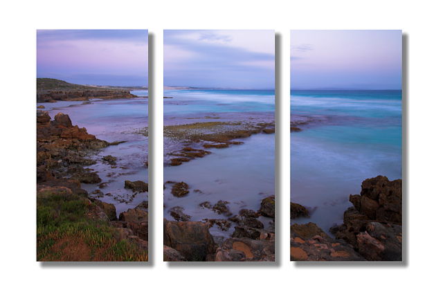
| A nice picture, and I think the triptych format does work well for it here. the composition is complex enough that the invitation to look at each part seperately is rewarding. as for the presentation, I find the drop shadow distracting. I think you'd have been better off with a more traditional outlining stroke. |
|
|
|
11/17/2005 08:36:59 AM |
| Fanastic scene, it feels like I am there looking at the scene |
|
|
|
11/16/2005 08:11:20 PM |
| this is nice. good very good |
|
|
|
11/15/2005 09:52:31 PM |
| A lovely image and one of the few single images that actually works well split up. Nice job. |
|
|
|
11/15/2005 04:02:11 PM |
| The shadows works well nice 3d effect.... |
|
|
|
11/15/2005 12:38:00 PM |
| I wish there was less border & more pic for me to look at. This is one of the few that work with one image split into three. lovely colors too- bumping to 8 |
|
|
|
11/15/2005 12:24:11 PM |
| One of those "one picture" triptychs. I like this one. I busted someone else for a 3D border, but I think it works here. 7 |
|
|
|
11/15/2005 11:05:33 AM |
| This is beautiful I love the 3-dimensional look of your panels. I think this fits well in the triptich format. |
|
|
|
11/15/2005 09:31:41 AM |
| Very beautiful photograph. The framing seems a bit heavy and takes away from the gorgeous scene. |
|
|
|
11/15/2005 08:05:44 AM |
| Great colors, the scene works well for this challenge. |
|
|
|
11/14/2005 10:32:23 PM |
| il ike the shot as a whole, but not so much as 3 different shots. too much white aswell. still a very pretty picture. 9 |
|
|
|
11/14/2005 06:58:10 PM |
| I like the drop shadow..really makes the picture! |
|
|
|
11/14/2005 06:38:32 PM |
| This is beautiful. I love the way the shore curve around the ocean. I don't know how you got those beautiful purple and blues in the water and sky, but they look perfect together. I also like how you split up this image and used the shadows behind the frames. 9. |
|
|
|
11/14/2005 12:43:29 PM |
| The drop shadows can't ruin a beautiful photo, but they sure try. I like the rich colors, especially standing out against the white background. The white bars in between really help make the frames pop. |
|
|
|
11/14/2005 10:58:44 AM |
| Gorgeous! Well executed. Would change nothing. 10 |
|
|
|
11/14/2005 02:09:50 AM |
| My favorite of the land/seascape type shots. Lovely soothing hues of lavender to blue to aqua. Just love it. Really pretty with the shadow around each one. 8 |
|
 Photographer found comment helpful. Photographer found comment helpful. |
Home -
Challenges -
Community -
League -
Photos -
Cameras -
Lenses -
Learn -
Help -
Terms of Use -
Privacy -
Top ^
DPChallenge, and website content and design, Copyright © 2001-2025 Challenging Technologies, LLC.
All digital photo copyrights belong to the photographers and may not be used without permission.
Current Server Time: 03/12/2025 11:55:45 AM EDT.