| Author | Thread |
|
|
11/29/2005 12:32:10 PM |
* Greetings from Critique Club *
First let me say congratulations on your 2nd best finish so far! I remember this image well from the challenge and scored it a 7.
Lighting Challenge Relevance:
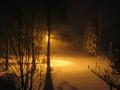
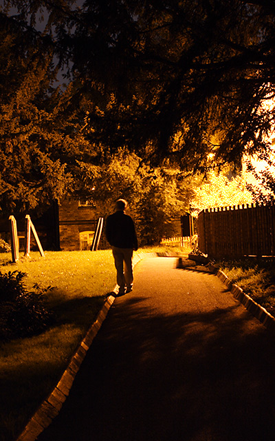
I think some voters mistook the artificial light source on the right (lamppost perhaps?) for the sun and counted some off for it (although if they had looked closer, they would have seen the night sky above the trees). You used a single light source quite effectively IMHO - I think it met the challenge quite well and was a strong entry.
Composition:
Here is where I think you probably took the biggest hit on your score. Several people commented on the centered position of the figure and I also notice the tilted horizon (while it can be used to emphasize artistically, I'm not sure it was effective here). I might consider straightening the horizon line and cropping more off the left - to offset your subject a bit more. I believe this would maintain the very strong mood you have so effectively established and alleviate some of the "centered composition" concerns.
Color/Focus:
I really like the warm tones you used - as I said above, you have established a very strong mood to this piece that really speaks to people (again as evidenced by people's comments). To me, it is very emotive and has an eerie loneliness feeling that is very appealing. The focus is a tad off (especially on the figure), but is not so much so that it is terribly distracting. I think you can get away with the man being OOF (showing movement), as long as the rest of the scene is sharp.
Overall:
I think that you got some positive feedback from commenters and that you submitted a strong entry into a tough challenge. Congratulations again on your 2nd best finish to date. I'm sure we will continue to see better and better things from you as you enter more challenges. Good work.
Just my 2 cents...
|
|
Comments Made During the Challenge  |
|
|
11/21/2005 10:40:15 AM |
| Great shot. Glad it was validated. Should finish quite high |
|
 Photographer found comment helpful. Photographer found comment helpful. |
|
|
11/20/2005 07:53:32 AM |
|
| Photographer found comment helpful. |
|
|
11/18/2005 04:44:28 AM |
| Must say, this image captures my imagination 7 |
|
| Photographer found comment helpful. |
|
|
11/17/2005 10:09:51 PM |
| The lighting is interesting and this could have been a great image if the composition was better. The person walking is just way too close to being dead center and I think the diagonal lines of the sidewalk could have been used a little better to draw you into the photo... |
|
| Photographer found comment helpful. |
|
|
11/16/2005 08:48:53 PM |
| I like it!!! Maybe if he wasn't so centered I would like it even more... |
|
| Photographer found comment helpful. |
|
|
11/16/2005 05:33:41 PM |
| The person is out of focus. I think you could have compose the photo differently to not have him right in the middle of the frame. |
|
| Photographer found comment helpful. |
|
|
11/16/2005 11:27:10 AM |
| Nice setup, composition, and color/tone choice. Thought about cropping some of the bottom, but I like the line of the walkway. Kept me looking. |
|
| Photographer found comment helpful. |
|
|
11/16/2005 01:56:03 AM |
| a pretty picture, but as I'm sure you'll hear several times, the sun is not an artificial light source. |
|
Home -
Challenges -
Community -
League -
Photos -
Cameras -
Lenses -
Learn -
Help -
Terms of Use -
Privacy -
Top ^
DPChallenge, and website content and design, Copyright © 2001-2025 Challenging Technologies, LLC.
All digital photo copyrights belong to the photographers and may not be used without permission.
Current Server Time: 03/14/2025 03:50:54 PM EDT.