| Author | Thread |
|
|
07/04/2003 10:16:32 PM |
*Critique Club*
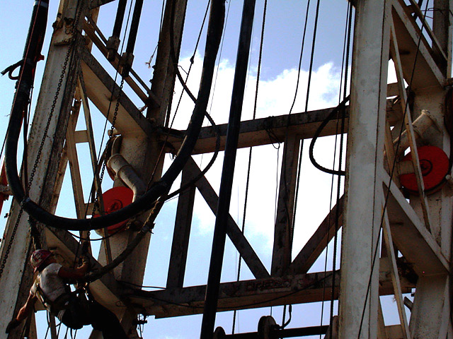
General: The angle of this shot is what adds interest to it. The lines leading from the bottom to the top give it height and size.
Composition: To add to the impact the man could have been placed a little higher up and to the right. Space below him may have given more of a sense of what he was doing. Also, tilting the image a little more so that the horizonal line at the bottom was parallel to the frame would also add to the sense of height. The red wheels on either side of the image are a bit distracting (only due to their colour).
Exposure: This was probably a very challenging image to take due to the strong backlight from the sky which put the rig in partial silouhette. To bring out the man on the rig you would have to add between 1/2 and 1 stop of exposure. One thing to ask yourself when taking any picture is what do you want to be medium in tone in the image. Remember that the camera's meter will try to make any image average (medium) in tonality. This is where the 18% grey is usually referred to. Since we are dealing in colour you have to determine what tone of any colour in the image represents a medium tone. If there is nothing around to meter off of then take something in the image and determine whether it is darker or lighter than medium and adjust the exposure accordingly (underexpose for darker and overexpose for lighter). I got this information from Gary Stanley. He has a very good article at //www.vividlight.com/articles/1411.htm .
Impact: As discussed in composition, more impact could probably have been attained if there was more space below the man. Did you try this as a vertical (portrait orientation) shot?
It's the challenging shots like this one that keeps us interested in photography. Good effort here. Give Gary Stanley's article on exposure a read. IMO he really simplifies the area of exposure. The hardest part is determining what a medium tone is. A grey card would help for situations where there does not appear to be a medium tone to meter off of that is in the same light as your subject.
Colette |
|
 Photographer found comment helpful. Photographer found comment helpful. |
|
|
06/30/2003 10:48:30 AM |
| Hi David. I'm not sure how this got way back here. I suppose it could use more light on the guy, but the photo still works. Unfortunately, most folks don't look for more than a few seconds (like 2 or 3!), so subtle shots like this, which are good, don't get the attention they deserve. Keep up the good work! |
|
| Photographer found comment helpful. |
Comments Made During the Challenge  |
|
|
06/29/2003 03:10:00 PM |
| Wish there was more "person" and less "structure" in the shot. Great subject matter, but the person in it is deep in the shadows. Also, it might help to "anchor" the structure better if the vertical lines were straight up and down instead of "tilting over". Not knowing what the entire structure looks like, this may not be possible or even "correct", but it looks like it is tilting to the right. Good job of capturing somebody "at work" though. |
|
| Photographer found comment helpful. |
|
|
06/28/2003 11:50:25 PM |
| The at work person is so small in this frame that it's hard to even find him. Good sky color and detail in the shadows. |
|
| Photographer found comment helpful. |
|
|
06/28/2003 03:52:02 PM |
|
| Photographer found comment helpful. |
|
|
06/27/2003 01:59:03 PM |
| Superb composition, though I'd like the worker to be just a little lighter. I love how the lines and machinery dominate the image and show the worker to be so small a part of it all. |
|
| Photographer found comment helpful. |
|
|
06/26/2003 10:08:24 PM |
I see no people, so I can't honestly see this being a work picture. Also, inside of the tower is a bit dark.
EDIT: Following the message, I can see the worker. However, I think it's from the backlighting (bright sun) that it's so dark inside. |
|
| Photographer found comment helpful. |
|
|
06/24/2003 12:20:38 AM |
| More guy in the tower would have made this work better...almost missed him. |
|
| Photographer found comment helpful. |
Home -
Challenges -
Community -
League -
Photos -
Cameras -
Lenses -
Learn -
Help -
Terms of Use -
Privacy -
Top ^
DPChallenge, and website content and design, Copyright © 2001-2025 Challenging Technologies, LLC.
All digital photo copyrights belong to the photographers and may not be used without permission.
Current Server Time: 03/14/2025 11:44:53 AM EDT.