| Author | Thread |
|
|
11/30/2005 01:37:46 PM |
Hello from the Critique Club!
I have studied your image and have the following to offer:
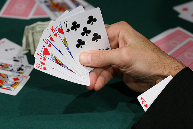
Composition/perspective - the view onto this shot is nice. It allows for a first hand view of the subject hand. The background is a little busy. Too many extra hands of cards with no attachment to anything as well as the money that is mostly hidden. Removing some of the cards and the money would remove some of the distraction. The focus is good in the foreground while the background is sufficiently blurred for the effect - good DoF. Position of the subject hand in the shot is a good application of the rule of thirds. The processing seems a little severe - the sleeve of the jacket looks painted in or more like you would want a background to appear. But for a jacket it is too smooth and lacks any detail whatsoever. This close to the sleeve I would expect to see at least a little of the detail of the weave of the fabric or slight variations in the surface. None of this is present.
Color - the colors here are good. They all seem to retain their original hue without being overbearing or over processed. The skin tones appear in the right range. The numbers on the cards appear solid with no blending or fringing into the white (more processing than anything).
Lighting - this may have hurt the image some. There are many conflicting shadows on the table which come across as distractions. There appears to be at least three, possibly four different shadow sets - too many. Also, the brightness of the lights may have caused you to process your levels a bit too much which is what caused the sleeve to appear somewhat fake. Perhaps adjusting the exposure (apperture/shutter speed) would have helped this and allowed the processing to be less severe which would have allowed more detail to be retained in the sleeve.
Challenge requirements - it meets the challenge requirements, but it may have been another area where it fell short. The subject was repeated many times in the challenge so an image would need something to really make it pop to stand out among all the others.
Overall/my opinion - with better lighting and less clutter on the table this would have been a stronger image. The distractions hold attention for too long and take away from the focus of the subject. |
|
 Photographer found comment helpful. Photographer found comment helpful. |
Comments Made During the Challenge  |
|
|
11/27/2005 10:44:33 PM |
| Another really bad cheater! What ... is the dealer blind!!! I want in on this game! |
|
| Photographer found comment helpful. |
|
|
11/27/2005 08:54:33 AM |
| I bump this up just for having clean nails. |
|
| Photographer found comment helpful. |
|
|
11/24/2005 12:16:15 AM |
| Probable the best set up poker shot of the bunch. Nice work. |
|
| Photographer found comment helpful. |
|
|
11/23/2005 07:09:15 PM |
How everybody think alike here. Aces up the sleeve theme all over...
Well this better then the last one. |
|
| Photographer found comment helpful. |
|
|
11/23/2005 05:52:21 PM |
I think I'd like to see this pic with some light bounced from the right to even things out a bit and pop out those cards without all the distracting shadows (like the shadow across the ace up the sleeve...)
Nicely composed and great dof! |
|
| Photographer found comment helpful. |
|
|
11/23/2005 05:55:25 AM |
|
| Photographer found comment helpful. |
|
|
11/22/2005 10:39:33 PM |
|
| Photographer found comment helpful. |
|
|
11/22/2005 11:58:43 AM |
| The background is too cluttered for me. |
|
|
|
11/21/2005 01:37:20 PM |
| Very clear and good use of dof. The effect may have been increased if only the very tip of the ace would show bur none theless you got the message across. |
|
| Photographer found comment helpful. |
|
|
11/21/2005 12:05:41 PM |
| One of the best card shots. Good composition, lighting, dof. Good job and good luck. |
|
| Photographer found comment helpful. |
Home -
Challenges -
Community -
League -
Photos -
Cameras -
Lenses -
Learn -
Help -
Terms of Use -
Privacy -
Top ^
DPChallenge, and website content and design, Copyright © 2001-2025 Challenging Technologies, LLC.
All digital photo copyrights belong to the photographers and may not be used without permission.
Current Server Time: 03/14/2025 06:37:48 PM EDT.