| Author | Thread |
Comments Made During the Challenge  |
|
|
11/29/2005 10:59:51 PM |
| Could be an interesting shot, but there's nothing in focus! |
|
|
|
11/29/2005 08:26:21 PM |
| Less blur would improve this a lot. |
|
|
|
11/28/2005 09:24:08 PM |
| i like the idea here but the pic seems out of focus, something just doesn't seem right to me |
|
|
|
11/28/2005 02:13:07 PM |
| Very nice idea for the challenge. Very well composed. The focus seems a bit off thought - nothing is really in focus. |
|
|
|
11/27/2005 04:29:21 PM |
| I think the man in red at the far right side of this image is distracting. I guess I would have tried to crop him out. |
|
|
|
11/27/2005 03:00:44 PM |
| Seems a little out of focus to me. |
|
|
|
11/27/2005 09:31:40 AM |
|
|
|
11/25/2005 03:02:49 PM |
|
|
|
11/25/2005 11:21:05 AM |
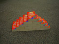
| Few steps closer and better focus... would've hide the overblown sky, and bring out some details. Very effective image though. |
|
|
|
11/25/2005 07:53:52 AM |
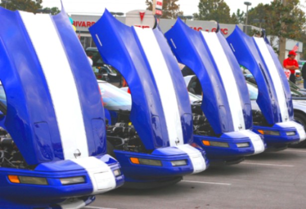
| Yes, 4 cars (Corvettes?) which makes it even, but the way they're shown with the hoods (bonnets) open certainly is odd. The image does appear a little soft to me, nothing is quit focused. |
|
|
|
11/25/2005 02:04:48 AM |
| Like it but wish it could've been a litle sharper (it looks a bit blurry to me) |
|
|
|
11/24/2005 07:27:47 PM |
| Love the gran Sports vettes but am not moved by this picture. |
|
|
|
11/24/2005 03:59:46 PM |
|
|
|
11/24/2005 11:59:33 AM |
| Good idea....lacks clarity though. |
|
|
|
11/24/2005 09:28:41 AM |
| Well seen. This could have done with slightly sharper focus I think. |
|
|
|
11/24/2005 05:34:30 AM |
| The image needed more focus IMO to be effective. |
|
|
|
11/23/2005 07:01:20 PM |
| seems slightly out of focus. But it's a neat concept |
|
|
|
11/23/2005 06:00:30 PM |
| It fits the challenge but it's not very sharp. Four Blur? |
|
|
|
11/23/2005 03:04:17 PM |
| The focus could be better. |
|
|
|
11/23/2005 02:41:09 PM |
| Looks like this picture could use more focus... |
|
|
|
11/23/2005 01:12:23 PM |
| Good shot. Too bad it is not in focus. |
|
|
|
11/23/2005 01:10:37 AM |
| A bit out of focus and too much saturation for my taste. The concept is good as is the composition. |
|
|
|
11/23/2005 01:03:29 AM |
| Great lineup, the repeated blue-white contrast is effective. Wish the image were sharper - might try to rescue it with Photoshop USM. |
|
|
|
11/23/2005 12:58:14 AM |
| visually interesting, good application of the challenge, but I wish the light wasn't so flat. Wouldn't it be nice to just be able to get a sunny day by wishing? |
|
Home -
Challenges -
Community -
League -
Photos -
Cameras -
Lenses -
Learn -
Help -
Terms of Use -
Privacy -
Top ^
DPChallenge, and website content and design, Copyright © 2001-2025 Challenging Technologies, LLC.
All digital photo copyrights belong to the photographers and may not be used without permission.
Current Server Time: 03/12/2025 09:32:22 AM EDT.