| Author | Thread |
|
|
12/09/2005 11:34:23 AM |
Critique Club Here...
Welcome to DPC!
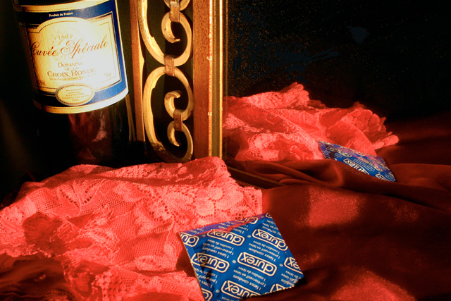
Composition: Nice overall, the tones and postiions. My eye is drawn to the condoms, their color does it as it stands out form the rest of image. The lower right of the iamge ia a but dark and stark - if the condoms were moved there i think it would improve the composition - this would balance the image and create a diagonal line across the image to lead the viewer through the 'story' that you have created. The bottle is crooked..might be better straight as it is standing next to a straight item.
Lighting: this could use a bit of work. It's obvious you are going for a very directional hard light. But the bottle has a hot spot on it that should be diffused/softened a bit. Any umber of materials could be used between the light and bottle to soften it (white -lastic trash bag, perhaps refelct in some light off a sheet of paper, use a white piece of cloth. Your expsoure of 30 seconds at ISO 400..and an aperture of f20? Too small an ap for most images, and ISO 400 can get noisy. F8 should have been plenty to get the DOF you needed. you can always move the camera back and zoom in or crop the image (for DPC entry you can REALLY crop an image :)
Fits the challenge topic well, has nice appeal overall. Just a tad short of being outstanding, missing that 'calendar' quality that does well here on DPC. |
|
 Photographer found comment helpful. Photographer found comment helpful. |
Comments Made During the Challenge  |
|
|
11/29/2005 01:06:11 PM |
| Being legally able to have sex is one of the strong rights of adulthood passage, maybe the strongest. Yet as a group we have not addressed this in the challenge because its so difficult to do. You've done it tastefully. Tecnically, the bottle label is overexposed a little too much and perhaps the top left is a little cluttered in composition. Personal preference would be not to have the bottle at anything but straight |
|
| Photographer found comment helpful. |
|
|
11/28/2005 07:37:14 PM |
| good one for the challenge |
|
| Photographer found comment helpful. |
|
|
11/28/2005 05:58:30 PM |
| the lighting on the wine bottle's label is a bit bright, washing it out a bit. like the composition of this image. |
|
| Photographer found comment helpful. |
|
|
11/28/2005 02:53:59 PM |
| composition could be improoved. lights not very good 4 |
|
| Photographer found comment helpful. |
|
|
11/28/2005 02:38:54 AM |
| I think you have a good idea here and well put together 7 |
|
| Photographer found comment helpful. |
Home -
Challenges -
Community -
League -
Photos -
Cameras -
Lenses -
Learn -
Help -
Terms of Use -
Privacy -
Top ^
DPChallenge, and website content and design, Copyright © 2001-2025 Challenging Technologies, LLC.
All digital photo copyrights belong to the photographers and may not be used without permission.
Current Server Time: 04/28/2025 07:01:44 AM EDT.