| Author | Thread |
|
|
12/09/2005 04:11:35 PM |
Hello from the Critique Club!
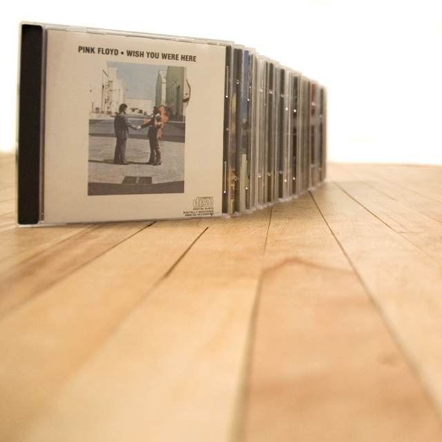
First of all, I want to applaud you on your interesting use of angles for this shot. I love that the lines of the wood panels bring your eye right to the CD cases, and those even create a line drawing your eye along their edges. This photo really keeps the eye active, really allowing it to keep exploring the shot deeper.
I really like that you got eye level with the cases and explored the use of depth of focus. Unfortunately, when you compare the amount of space the wood takes up to the amount of space the CD cases take up, it's overwhelming, and that feeling comes across in the photo. The CD cases are just an afterthought in this photo, instead of the dominant item.
I also think that increased color and contrast would have added a lot to this photo. The whole thing seems very washed out, which can be effective if used the right way, but unfortunately in this shot it is not. In a shot this pale, the eye is going to be drawn to the point of the greatest contrast, which is the black edge of the front CD case against the white wall in the background, and that's probably the last place you want the eye to linger because it's just not that interesting in relation to everything else in the frame. If you had chosen a darker or more colorful front album, I think this would have been mitigated a bit. Upping the contrast would also have emphasized the lines in the wood more.
Finally, I just do not like the way the CD cases are laid out. In my personal opinion, I think they should be spaced out more, allowing more of the edges of each case to be seen. I also agree with whichever commenter suggested that you make this photo more horizontal, as that would have placed more emphasis on the real subject of the photo.
I hope these comments have helped. Good luck in the future! |
|
 Photographer found comment helpful. Photographer found comment helpful. |
Comments Made During the Challenge  |
|
|
12/06/2005 09:16:55 PM |
| i think this image could have more of the foreground cropped out to bring greater attention to the collection. an interesting composition, and one of my favorite albums! |
|
| Photographer found comment helpful. |
|
|
12/02/2005 03:06:46 AM |
| cliche, I dont see why the lable or artist of a particular cd maters to the theme of a collection I can understand to how this particular cd would have an impact on you but to the viewer it created a certain bias in observing the image and distracts the viewer of what else may be trying to be portrayed in the image. I think if you put the first cd out of focus it would have a greater impact to what your want to say in the image it creates more disidance in turn keeping the attention of the veiwer longer. |
|
|
|
12/01/2005 01:15:56 PM |
| Consider cropping out more of the blurred foreground to make it better, or else increase DOF some. |
|
|
|
12/01/2005 09:11:42 AM |
|
| Photographer found comment helpful. |
|
|
12/01/2005 07:17:27 AM |
| aaaaaaaaaaaaaaaaaaah love Pink Floyd. I like the way you laid it out and the angle the photo was taken at. |
|
| Photographer found comment helpful. |
|
|
11/30/2005 05:51:40 PM |
|
| Photographer found comment helpful. |
|
|
11/30/2005 04:07:00 PM |
| I like the set up. Although I would like to see it were more horizontal |
|
|
|
11/30/2005 02:33:50 PM |
|
| Photographer found comment helpful. |
|
|
11/30/2005 01:32:01 PM |
| Nice job! This is an interesting,appealing, nicely composed photo in a challenge that is proving to be a little boring. Great job! |
|
| Photographer found comment helpful. |
|
|
11/30/2005 12:47:31 PM |
| I wish you cropped the foreground to put more in the space the great collection |
|
| Photographer found comment helpful. |
|
|
11/30/2005 06:34:19 AM |
| 4 - Like the angle, colors and simplicity. Criticism; seems it needs a nudge rotation up on the right. Perhaps a different colored background too, especially with the chosen 'front cover' as it seems a bit 'washed out' in my opinion. The sharpest focus also seems to be on the wood, rather than the cds. |
|
|
|
11/30/2005 01:32:35 AM |
| A little washed out (needs more contrast) and maybe better to see more of the titles. Nice job though - and Pink Floyd - even Trolls like Pink Floyd. :) |
|
Home -
Challenges -
Community -
League -
Photos -
Cameras -
Lenses -
Learn -
Help -
Terms of Use -
Privacy -
Top ^
DPChallenge, and website content and design, Copyright © 2001-2025 Challenging Technologies, LLC.
All digital photo copyrights belong to the photographers and may not be used without permission.
Current Server Time: 03/14/2025 09:27:52 AM EDT.