| Author | Thread |
Comments Made During the Challenge  |
|
|
12/07/2005 07:12:07 AM |
| Lacks contrast and colorsaturation imo. Also some clearer point of interest. |
|
 Photographer found comment helpful. Photographer found comment helpful. |
|
|
12/05/2005 11:08:01 PM |
| Great composition, but not enough contrast; the blacks aren't black enough. |
|
| Photographer found comment helpful. |
|
|
12/03/2005 08:21:21 AM |
| Nice image. As a suggestion for improvement, I'd try to enhance the contrast and color saturation a bit, to make it "pop". |
|
| Photographer found comment helpful. |
|
|
12/02/2005 04:38:46 PM |
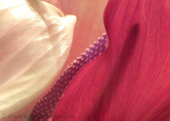
| Nice macro, but the colors are detail are a little muted. I would have done a little more saturation and sharpening. It has a nice soft feel to it though. |
|
| Photographer found comment helpful. |
|
|
12/02/2005 09:30:04 AM |
|
| Photographer found comment helpful. |
|
|
12/01/2005 10:10:33 PM |
4 - Nice colors, good potential. Criticism; definitely 640 width in this case would have helped, if the quality was an issue in not going that big (and you didn't have 'more' to incorporate) then perhaps even the inclusion of a complementary frame may have helped. Like to see that spadix sharper, although you may well be going for a 'soft look'. The shadow play is nice but if it were enhanced 'somehow', make this even better in my opinion. Nice colored spathes and spadix on what looks like an Anthurium. edit:typo
Message edited by author 2005-12-08 16:17:07. |
|
| Photographer found comment helpful. |
|
|
12/01/2005 02:30:40 AM |
Nice lines, interesting shadow of the stamen.
The bright white on the top left is blown-out, no detail, a little grainy.
nice detail and textures. |
|
| Photographer found comment helpful. |
Home -
Challenges -
Community -
League -
Photos -
Cameras -
Lenses -
Learn -
Help -
Terms of Use -
Privacy -
Top ^
DPChallenge, and website content and design, Copyright © 2001-2025 Challenging Technologies, LLC.
All digital photo copyrights belong to the photographers and may not be used without permission.
Current Server Time: 03/18/2025 05:00:31 AM EDT.