| Author | Thread |
Comments Made During the Challenge  |
|
|
12/06/2005 10:34:33 PM |
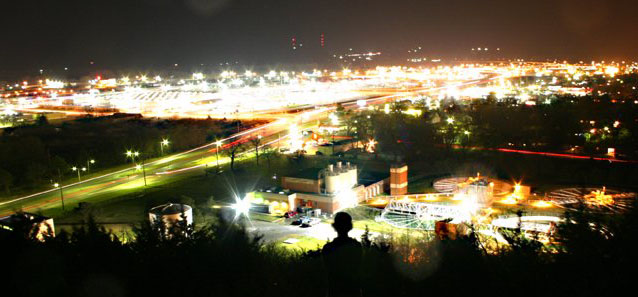
| Way over expoesed considering the quantity of lights in the upper-middle portion. |
|
 Photographer found comment helpful. Photographer found comment helpful. |
|
|
12/06/2005 05:06:38 PM |
| This seems overexposed. The brightest parts have lost all detail. |
|
| Photographer found comment helpful. |
|
|
12/05/2005 01:00:21 PM |
| This could be a really nice nightscape, but the far side of town is too washed out. I think you left the shutter open too long. This side of town looks better. If it was hard to get both perfect, maybe a choice should be made to pick one area or the other. |
|
| Photographer found comment helpful. |
|
|
12/04/2005 06:31:11 PM |
| for me the brightness of the white is a little too distracting, but nice view |
|
| Photographer found comment helpful. |
|
|
12/01/2005 02:57:54 PM |
| I think this would have made a better shot if it wasn't so over exposed. It's hard to see any detail with the brightness of the lights. |
|
| Photographer found comment helpful. |
|
|
12/01/2005 10:25:09 AM |
| Interesting arial, but I'm not sure what to focus on--it's a bit busy. The person's head in the middle really adds interest to this shot. |
|
| Photographer found comment helpful. |
|
|
11/30/2005 02:17:56 PM |
| This does have that busy industrial feel, I would have liked blacker blacks, more contrast |
|
| Photographer found comment helpful. |
|
|
11/30/2005 10:22:00 AM |
|
| Photographer found comment helpful. |
Home -
Challenges -
Community -
League -
Photos -
Cameras -
Lenses -
Learn -
Help -
Terms of Use -
Privacy -
Top ^
DPChallenge, and website content and design, Copyright © 2001-2025 Challenging Technologies, LLC.
All digital photo copyrights belong to the photographers and may not be used without permission.
Current Server Time: 03/12/2025 08:48:18 AM EDT.