5.5 for this pic is definitely low, however i feel there is one reason that it did not click with lot of people, you see the truss arms originating from right base, the origin is not visible, i feel that had you put the origin of these trusses into the image. Take for example first place collection entery, that entry is simple but the center of cryons is at the place where i am suggesting. This appeals to these photographers here.
i am not sure where it is some subconscience thing, but these photographers here at DPC are thought that these spot as center is best composition and they have tendency to vote them high. its just a sheep walk, but it is truth. (collection entery's first place confirm that, i do not see anything great in that otherwise).
Other all the things DrAchoo has pointed out.
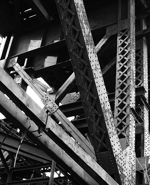
This is going to be a little shorter than some I've done since you scored fairly well. 5.5 is nothing to be ashamed of. I think the right side of the picture is excellent and visually dynamic. The left side (particularly the bottom) is a big more muddled and jumbled and is probably the weak section of the picture. Of course you may not have been able to shoot the girders without this section. I see there is a second vertical girder at the right edge, was there a diagonal which mirrored the one we see? That may have been interesting. The problem here is that your eye has no dominant line to follow. We try to follow the diagonal, but quickly get distracted by the weaker diagonal which competes. The texture and pattern is not as interesting on that beam as well. I like the bolt pattern, but the lower-left is basically drab gray.
Your B&W coversion, I think, is well done. The contrast is also nice. Focus is sharp. So overall the technicals are just fine. Again, I think this is why you scored fairly well.
EDIT: Ha, remember I don't read your other comments before I leave mine. Seems like we may be onto something...
This is my kind of shot (in fact I think I have some very similar ones), but I think your composition could use a little work. It seems a little cluttered in the lower left, and the tree branch in the lower right is a little distracting.