| Author | Thread |
|
|
03/10/2024 10:40:58 AM |
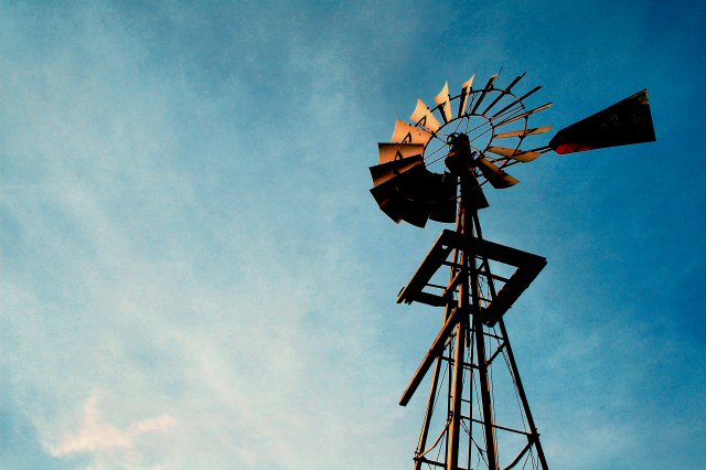
I totally disagree with CNiovacks assessment of this image below. I agree that could be an interesting take on the subject, but disagree that it would �improve� the image. The negative space provides room for the viewer to imagine the vast expanse this subject lives in. The clouds add just the right amount of visual interest. The blue and gold contrasting colors are the chefs kiss! Love this image!
Message edited by author 2024-03-10 10:42:01. |
|
Comments Made During the Challenge  |
|
|
12/02/2005 03:08:37 AM |
I like the colour of the sky in this and the lighting on the mill
a very good image |
|
|
|
12/01/2005 09:41:20 AM |
| An interesting shot and composition. I like how you took this from an angle that has the viewer looking up to gaze on the main subject: the windmill. There are two things that I can suggest that would go into improving this shot. First, it would have been better to capture the full windmill so that it adds to our sense of height as we look up at it. Second, there is too much empty space which does nothing to add to the composition of the overall image - the clouds are nothing special in this shot, your main focus is the windmill and should stay on the windmill. Tightly cropping the shot to be a vertical one that has the windmill either in the center or slightly off center would add interest by giving us a greater sense of height, keeping our attention focused on the main subject, and the vertical aspect mimics & complements the height of the windmill. |
|
Home -
Challenges -
Community -
League -
Photos -
Cameras -
Lenses -
Learn -
Help -
Terms of Use -
Privacy -
Top ^
DPChallenge, and website content and design, Copyright © 2001-2025 Challenging Technologies, LLC.
All digital photo copyrights belong to the photographers and may not be used without permission.
Current Server Time: 03/17/2025 06:25:33 AM EDT.