| Author | Thread |
Comments Made During the Challenge  |
|
|
12/07/2005 06:23:12 PM |
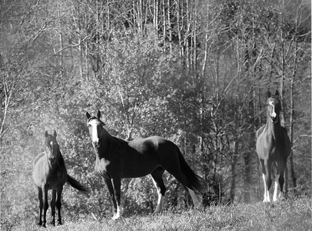
| Interestingly, before I read your title, my first thought was "it's very gray and could use a boost in contrast." I can see where any more contrast on the center horse might have been over the top, but with advanced editing you could have used a mask. Mostly I see gray. |
|
 Photographer found comment helpful. Photographer found comment helpful. |
|
|
12/05/2005 08:34:32 PM |
| I think the horses could be a touch sharper, and either a larger or smaller DOF. The background takes up a large portion of the picture, and I find it frustratingly in between focused and totally blurred out--I can see the detail, but it's not sharp enough to be appealing. I think I would like it best with a large DOF and everything in focus, but smaller DOF to blur the background more could work too. |
|
| Photographer found comment helpful. |
|
|
12/04/2005 02:03:01 PM |
| I don't sense high contrast. I sense blurred and blown out. This has great potential, but it's tilted too. I'd straighten it, make sure I had tack sharp focus and shoot when the light isn't so bright. As it is, it blanches them out somewhat. I might zoom in on a single horse for more impact. |
|
|
|
12/02/2005 12:06:11 AM |
| Not really much pop to this photo. It's hard to say without seeing it in color but I feel like maybe it would do better that way. There seems to be some odd editing effects around the horse on the left and at the feet of the horse on the right and in some random places throughout the rest of the photo - dodged maybe? There just isn't enough to draw the horses out of the background. |
|
Home -
Challenges -
Community -
League -
Photos -
Cameras -
Lenses -
Learn -
Help -
Terms of Use -
Privacy -
Top ^
DPChallenge, and website content and design, Copyright © 2001-2025 Challenging Technologies, LLC.
All digital photo copyrights belong to the photographers and may not be used without permission.
Current Server Time: 04/02/2025 12:48:40 AM EDT.