| Author | Thread |
|
|
12/17/2005 07:31:32 PM |
from the inside back page of the Critique Club
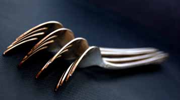
Now this, i think, might possibly have been an interesting image - but in dimensions its less than a quarter, and in data only about 3% or what's available to you here. I know it's been said over and over in comments, but it's so true it doesn't hurt to re-inforce it.
The technical stuff really is a problem. From what one can tell, it might well ahve been a fine image - a decent idea, and certainly well executed - the depth of field looks good, and the colour and tonality is great too. Compositionally, you might have benefitted a touch from using the stronger diagonal line more - the curves of the forks hint at that, but the handles go straight to the edge of frame, which is usually a weaker idea; also, had you had that line of the handles heading up into the top right of frame, more of the tines of the forks might be visible which would also strengthen the detail in the shot.
But it's the size thing that does for this - as I look, it's very hard to see the compression artefacts around the forks, so obviously any real detail is going to be equally difficult to see. |
|
 Photographer found comment helpful. Photographer found comment helpful. |
Comments Made During the Challenge  |
|
|
12/11/2005 06:57:58 PM |
| would have made more sense if those were spoons but what really bothers me is how small the image is, very hard to form an opinion on something that's only 357 pixels wide. |
|
| Photographer found comment helpful. |
|
|
12/11/2005 03:32:13 PM |
| Try to use odd numbers. 4 is off balance. Yet very good. |
|
| Photographer found comment helpful. |
|
|
12/11/2005 08:00:14 AM |
| you have a beautiful image but its too small. maximize your size to 640pixels on the widest side. you'll have your voters see more details. |
|
| Photographer found comment helpful. |
|
|
12/09/2005 10:58:37 AM |
| I'm afraid this is too small, but it seems to be a nice shot. |
|
| Photographer found comment helpful. |
|
|
12/08/2005 04:17:08 PM |
| The lighting looks pretty good on this shot, but I wish I could see it at a larger size! :-) Good composition on this shot...your eye gets drawn from the tines of the fork all the way down the handle. |
|
| Photographer found comment helpful. |
|
|
12/06/2005 10:55:14 PM |
| Great concept! I particularly like how the four forks together look like one fork lying face down. But why such a small image? And worse yet, why so over-compressed? You realize the file is only 5.8KB?!? I hope you still have the original and upload a proper sized image without compression artifacts after the challenge, a photo this good deserves much better than this. 6 (would have been a 10) |
|
| Photographer found comment helpful. |
|
|
12/06/2005 09:16:24 PM |
More like "forking" ;)
In the future, you probably will want to size your photo such that the longest dimension is 640 pixels, to take advantage of the max allowable size. Yours is only 357 pixels. Voters get very turned off by small photos, for some reason. Other than that, this is a nice shot!
|
|
| Photographer found comment helpful. |
|
|
12/06/2005 03:38:33 PM |
|
| Photographer found comment helpful. |
|
|
12/06/2005 12:39:38 PM |
| Ha. Love the twist on words to describe the objects here. |
|
| Photographer found comment helpful. |
|
|
12/06/2005 05:57:38 AM |
| nice idea, but you should read the tutorials on image sizing before submitting to another challenge. |
|
| Photographer found comment helpful. |
|
|
12/05/2005 10:47:23 PM |
| next time try using a larger image size, I like the DOF though... |
|
| Photographer found comment helpful. |
|
|
12/05/2005 04:53:30 PM |
|
| Photographer found comment helpful. |
|
|
12/05/2005 01:27:55 PM |
| maybe next time enter a larger photo, this one really is too small IMO |
|
| Photographer found comment helpful. |