| Author | Thread |
|
|
12/18/2005 11:31:45 PM |
Greetings from the Critique Club Kita!
First off, I think it�s great that at 8 years old you are jumping into something like this.
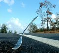
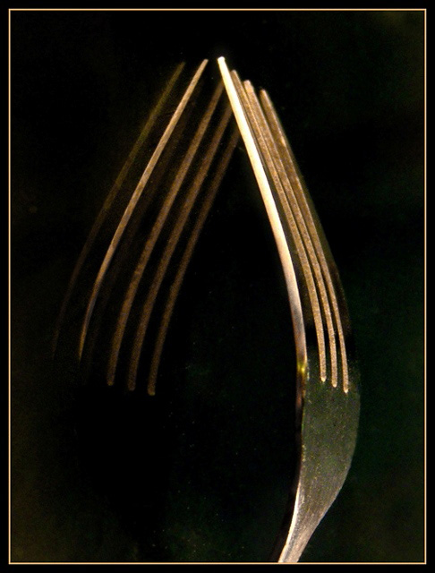
I like what you are going for and the border works well with the photo. If I were shooting this I think I would have left it in landscape orientation. With the reflection it just seems like it should be landscape as forks standing straight up and left right reflections just don�t feel right to me. I�m not sure if the grain and the spots were intentional, but again, if I were shooting I�d have used a shiny clean background. Also, the sharpness seems a little off. Did you use a tripod? If you did, you had some focusing issues, if not you should have.
Good idea done pretty well. I�d have done a few things differently, but I�m definitely not the expert.
I hope you find this helpful. If you have any questions or comments on my review please feel free to PM me.
|
|
 Photographer found comment helpful. Photographer found comment helpful. |
|
|
12/14/2005 07:53:30 PM |
| I gave this a 3. The quality was not there 'enough' in my opinion. It also seemed a little 'too close', causing the focus to blur. The composition/placement of the fork within the 'frame', perhaps could have used some more attention - to try to get an overall 'balance' using 'empty space' - unless you were going for the 'mirror effect', which, in my opinion, needed to have better 'symmetry' (balance again), so a 'nudge rotation' up on the right may have helped. There also seems to be some 'grain' &/or issues with 'gamma' in the darker areas. |
|
| Photographer found comment helpful. |
Comments Made During the Challenge  |
|
|
12/08/2005 02:00:47 PM |
| love the simplicity and the frame |
|
| Photographer found comment helpful. |
|
|
12/05/2005 02:36:01 PM |
| Nice study in shadows and light. One of my favs on a challenge I cannot vote on ;( |
|
| Photographer found comment helpful. |
|
|
12/05/2005 01:45:11 PM |
| interesting. i like the tones and textures. |
|
| Photographer found comment helpful. |
|
|
12/05/2005 01:12:39 PM |
| I like the broken symmetry. Maybe it would look better in B&W? |
|
| Photographer found comment helpful. |
Home -
Challenges -
Community -
League -
Photos -
Cameras -
Lenses -
Learn -
Help -
Terms of Use -
Privacy -
Top ^
DPChallenge, and website content and design, Copyright © 2001-2025 Challenging Technologies, LLC.
All digital photo copyrights belong to the photographers and may not be used without permission.
Current Server Time: 03/12/2025 07:03:07 PM EDT.