| Author | Thread |
Comments Made During the Challenge  |
|
|
12/13/2005 04:33:48 PM |
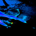
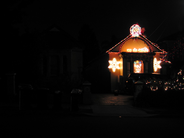
| When i only look at the picture not knowing your given title... i would have not seen the relevance with the challenge. |
|
|
|
12/12/2005 06:49:28 PM |
| this picture is too dark for me and the lights are too far away to see any detail, maybe a tighter crop could improve this and make the decorations appear larger |
|
|
|
12/09/2005 04:47:52 AM |
| Quite dark image, one would have to see a little more details around the illuminated place. |
|
|
|
12/07/2005 07:42:08 PM |
| this is too dark and the lights are to blured. If you played around with this idea more I think you could have found a better shot, or fixed it up a bit on the computer |
|
|
|
12/07/2005 03:04:16 PM |
| i love it-i like the way you took the picture with the house to the right-great colors=10 |
|
|
|
12/07/2005 05:20:53 AM |
| What a strange composition. Such a waste of space on the left. You have to get a little detail in those areas and not just black. |
|
Home -
Challenges -
Community -
League -
Photos -
Cameras -
Lenses -
Learn -
Help -
Terms of Use -
Privacy -
Top ^
DPChallenge, and website content and design, Copyright © 2001-2025 Challenging Technologies, LLC.
All digital photo copyrights belong to the photographers and may not be used without permission.
Current Server Time: 03/12/2025 08:27:38 PM EDT.