| Author | Thread |
Comments Made During the Challenge  |
|
|
12/18/2005 09:53:06 PM |
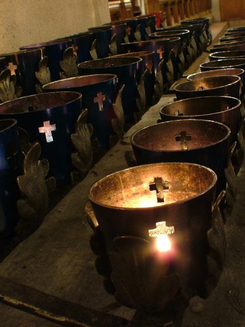
| Nice composition and lines. May be cropping out the background would have made this a stronger image. |
|
|
|
12/18/2005 09:02:21 PM |
| cropping off the top so we could just see the rows of candle holders and not the distracting background behind would have made for a more appealing image. A little lower might have shown more glows through the crosses also. |
|
|
|
12/17/2005 11:02:49 PM |
| you shoudl have dimmed the lights... |
|
|
|
12/16/2005 05:47:51 PM |
| Thats Shine is a little distracting but i like the shot! |
|
|
|
12/13/2005 11:23:02 PM |
| The flame in the front is too harsh when considering the overall picture. |
|
|
|
12/13/2005 09:39:24 PM |
| I like this setup but seems tilted back, would prefer level. |
|
|
|
12/12/2005 10:31:37 PM |
| This shot would have looked much more amazing if it was cropped little more closely from top and bottom. Another thing that would have made it stand out is the blue color of the stands. |
|
|
|
12/12/2005 09:51:49 AM |
| very good like result, and I like much the prospect. |
|
Home -
Challenges -
Community -
League -
Photos -
Cameras -
Lenses -
Learn -
Help -
Terms of Use -
Privacy -
Top ^
DPChallenge, and website content and design, Copyright © 2001-2025 Challenging Technologies, LLC.
All digital photo copyrights belong to the photographers and may not be used without permission.
Current Server Time: 03/12/2025 09:50:49 AM EDT.