| Author | Thread |
|
|
12/31/2005 01:27:16 AM |
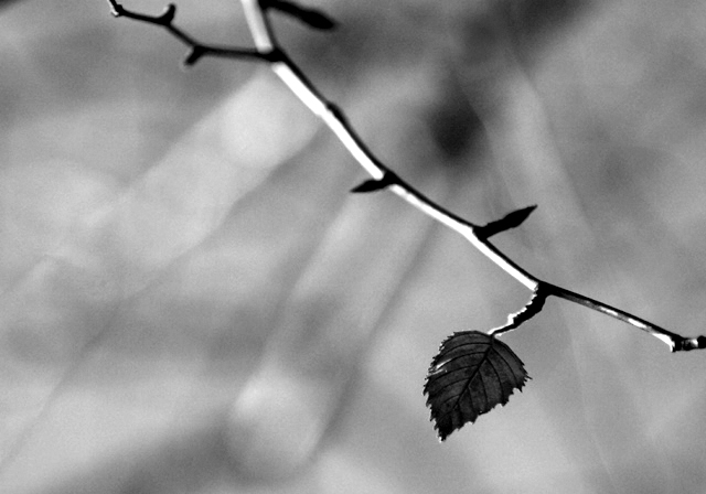
| I agree with a previous post. It really does nothing for me. It's A little uninspiring and the background wants too much attention from the viewer.But don't feel bad. take the advice and Keep going like the rest of us! |
|
 Photographer found comment helpful. Photographer found comment helpful. |
|
|
12/31/2005 12:35:54 AM |
I really like the composition. My only complaint is the distracting background. What I think dropped your score the most is the grain. I personally don't mind the graininess, but DPC generally does.
Message edited by author 2005-12-31 00:37:21. |
|
| Photographer found comment helpful. |
|
|
12/31/2005 12:27:02 AM |
| I think a 5 was a fair score on this image. The subject is clear but the overall image isn't strong or powerful to me. Nothing really grabs me, makes me say cool or wow... I typically like b&w images but I wonder what the color version looked like. The 3 branches in the background are a bit distracting and the blown out parts of the branch are as well. I think you composed/placed the leaf nicely - following the rule of thirds. The top branch that is cut off (can't see the end) sort of bothers me, though not sure why. I do like the grain. I think to make this image stronger you should have focused more closely on the leaf and bit of branch it's attached too. Focusing on a small part will fill up the frame and we will really have a clear and strong subject. The background is uninteresting here so by focusing closer and letting the leaf slowly fall out of focus would be appealing, imo. Macros seem to do well in shallow dof challenges. |
|
| Photographer found comment helpful. |
|
|
12/28/2005 10:22:24 AM |
| you were robbed. this is great. |
|
| Photographer found comment helpful. |
Comments Made During the Challenge  |
|
|
12/27/2005 03:30:59 PM |
|
| Photographer found comment helpful. |
|
|
12/27/2005 10:36:42 AM |
| I do like that you chose to make this image B & W...it really forces the viewer to see the light, the tones and texture...very nice. |
|
| Photographer found comment helpful. |
|
|
12/27/2005 09:08:37 AM |
|
| Photographer found comment helpful. |
|
|
12/26/2005 01:36:37 PM |
| I like the light play of the background. It enhances the subject. But I would have liked the light on the front of the leaf. |
|
| Photographer found comment helpful. |
|
|
12/25/2005 05:23:57 PM |
| An elegant idea, effectively executed. The depth of field nicely isolates the subject, but there's also something appealing about the inverted fan shape of the out-of-focus background material. 7. |
|
| Photographer found comment helpful. |
|
|
12/23/2005 09:08:01 AM |
Just back for some comments...
This photo has a lot of things going for it.. the composition, placement of the one tiny leaf, and its general simplicity leaving the viewer feeling almost sorry for this last leaf. However, I think the lighting on the leaf is a bit dark, which leaves the viewer also trying to determine if it really is in focus and therefore completely meeting the challenge. I don't know what colors you were originally working with, but perhaps leaving the color would have also helped to make this one "pop!" I think the other downfall of this photo happens to be that there were so many photos with similar subject matter. Best of luck to you! |
|
|
|
12/22/2005 02:31:30 PM |
| leaf just not sharp enough for me to give this a GREAT score. |
|
|
|
12/21/2005 04:19:56 PM |
| In with the new, out with the old. |
|
| Photographer found comment helpful. |
Home -
Challenges -
Community -
League -
Photos -
Cameras -
Lenses -
Learn -
Help -
Terms of Use -
Privacy -
Top ^
DPChallenge, and website content and design, Copyright © 2001-2025 Challenging Technologies, LLC.
All digital photo copyrights belong to the photographers and may not be used without permission.
Current Server Time: 03/12/2025 03:10:07 PM EDT.