| Author | Thread |
|
|
05/14/2006 01:41:01 AM |
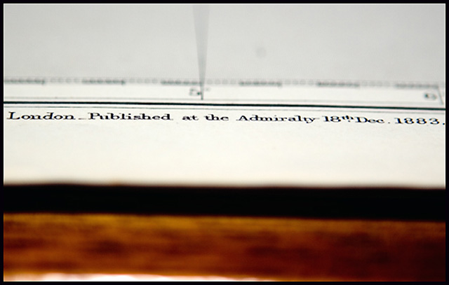
| I like the abstractness of this photo, and from a technical point of view it's really well done, it's well exposed and sharp. The biggest problem I think is that this is just a little bit crooked. Straightening the horizonals would have been nice. Also, as far as the challenge goes, focusing on a different part of the chart which may have been a bit more recognizeable would have been nice for the viewer. Or perhaps shooting at a higher angle so that the line you have is still the focus, but more of the chart is visible so the viewer has a better idea of what's going on. |
|
 Photographer found comment helpful. Photographer found comment helpful. |
Comments Made During the Challenge  |
|
|
12/27/2005 07:27:13 PM |
| I am not a fan of this genre of photo, perhaps because it's been done so much. It's a decent technical execution. The composition could be strengthened by paying more attention to the rule of thirds. |
|
| Photographer found comment helpful. |
|
|
12/22/2005 03:58:36 PM |
| This looks like a back-focus test chart. |
|
| Photographer found comment helpful. |
Home -
Challenges -
Community -
League -
Photos -
Cameras -
Lenses -
Learn -
Help -
Terms of Use -
Privacy -
Top ^
DPChallenge, and website content and design, Copyright © 2001-2025 Challenging Technologies, LLC.
All digital photo copyrights belong to the photographers and may not be used without permission.
Current Server Time: 04/02/2025 05:23:57 PM EDT.