| Author | Thread |
Comments Made During the Challenge  |
|
|
06/30/2002 10:53:00 PM |
| Seems like it should be more busy to truly represent city life. |
|
|
|
06/30/2002 10:09:00 PM |
| I thought malls were in the suburbs. |
|
|
|
06/30/2002 09:08:00 PM |
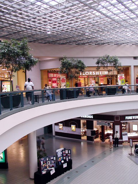
Malls are boring.. ;-) Also maybe you should have used a faster shutter speed because some people are blurred. I know, slower shutter speeds give this nice effect of creating activitiy in a photo but this only works when there are more people...
I also think it would have been better when you photographed just one of the levels. Currently it's hard for the viewer to decide where to look at on this photo. There are two photos in one ;-) The center shows boring concrete which devides the photo.
Photo 5, Creativity 2, City Life 6 = 4 |
|
|
|
06/30/2002 03:46:00 PM |
| I like the arc the second floor makes, but beyond that nothing really catches my attention. It looks like the entire photo needs to be rotated just a couple of degrees clockwise (the Florsheim sign isn't straight). I like the long exposure time to give the people a blur -- maybe if you'd shot this at a busier time of day with an even slower shutter speed. Given it a sense of a lot of people scurrying about on their own separate quests. |
|
|
|
06/30/2002 12:50:00 AM |
| this mall looks very familiar.. where is it? |
|
|
|
06/28/2002 11:29:00 AM |
| I love the architecture, and the way your curve divides the shot. The only thing I don't like is the people in the shot .. I'd like to see it either with LOTS of people or with no people at all. The amount of people you have in the shot just kind of forces an attitude of "eh" ... that make sense? |
|
|
|
06/28/2002 04:00:00 AM |
|
|
|
06/26/2002 06:52:00 PM |
| Business doesn't look very booming. (Sunday morning at opening time?) Like so many sevens this week, I see nothing in this shot that appears technically wrong, nor do I see anything that would prompt me to view this shot again. (My shot this week is a bit boring too) Photo 8 City 6 total 7 |
|
|
|
06/25/2002 04:19:00 PM |
| Very nice! I really like the composition of this photo. the curved walkway works very nicely. You have a good eye to catch this and use it in your photo. I also really like the motion blur on the people in this shot. It adds a nice sense of 'life' to the photo. The lattice ceiling also offers some nice eye candy in this shot. The only MINOR detail I see in this photo that I don't like (and it does not detract from the score) is the bottom of the escalator showing in the lower right portion of the frame. It looks just slightly out of place. Good shot! = 8 - jmsetzler |
|
|
|
06/25/2002 02:01:00 PM |
| a monument to consumerism.....nice lighting |
|
|
|
06/24/2002 08:51:00 PM |
| Nice capture of the ceiling; middle, and bottom floor. I like the curve as well. |
|
|
|
06/24/2002 06:52:00 PM |
| Funny how they nearly all look the same. You could tell me that this was the Bellevue Square Mall in WA. and I would be inclined to believe it. Good exposure, nice color. Could be a bit sharpe. Maybe use a bit more unsharp mask in post processing? |
|
|
|
06/24/2002 12:50:00 PM |
| Mall anywhere USA. <g> Very nice angle and not a bad photo, just boring. Kee |
|
|
|
06/24/2002 11:53:00 AM |
|
|
|
06/24/2002 09:04:00 AM |
| why is that man on the bottom talking to that 14 year old!?!?! i hope they're related ;x "that skirt is too short, young lady!" |
|
|
|
06/24/2002 01:38:00 AM |
| LOL... small world that it is, I think I critiqued a picture taken in this same mall on PhotoSIG this morning (if you're Pete Nicholls, then I know I did). No worries, I don'r mark down for that. Nice capture and good lines, but there's a small bit of blur here that I find distracting. |
|
Home -
Challenges -
Community -
League -
Photos -
Cameras -
Lenses -
Learn -
Help -
Terms of Use -
Privacy -
Top ^
DPChallenge, and website content and design, Copyright © 2001-2025 Challenging Technologies, LLC.
All digital photo copyrights belong to the photographers and may not be used without permission.
Current Server Time: 03/13/2025 10:19:49 AM EDT.