| Author | Thread |
|
|
01/08/2006 12:03:17 PM |
Greetings from the Critique Club
Welcome to DPC. You have two Challenges under your belt now and it looks as if you are enjoying the site.
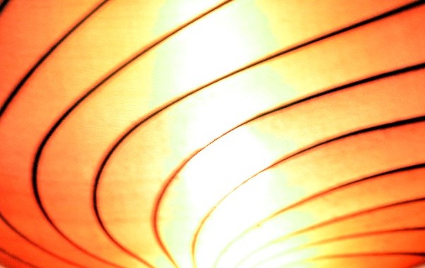
You asked for a Critique on your nice photo, so here I am. The image met the Challenge nicely with the great pattern - I'm guessing in a ceiling. I really like the colors and the composition. Both work well.
As some of your commentors pointed out, your image could use better focus and parts of it are "blown out" or very 'hot'. Unless you were taking this in near pitchblack conditions, I think your ISO of 800 is a touch high and with a shutter speed of a second and a half, unless you used a tripod, you really had no chance of a good sharp image.
This is the type of shot that cries out for bracketing. If it was mine, I'd try under exposing and over(well maybe not on this one) exposing, changing ISO numbers, changing aperture openings.
You've got a great camera that can do a lot for you. And you've got a good eye. I look forward to seeing more of your work on DPC.
Alice |
|
 Photographer found comment helpful. Photographer found comment helpful. |
|
|
01/04/2006 12:19:12 PM |
| I love it! Great work... keep it up! |
|
| Photographer found comment helpful. |
Comments Made During the Challenge  |
|
|
01/03/2006 03:58:55 PM |
| This is a great pattern though I think I would prefer it sharper. The centre is a little over exposed too. I think if these were better you would have nailed it with this shot. |
|
| Photographer found comment helpful. |
|
|
01/03/2006 01:37:21 PM |
| this would make a stunning desktop image! love it |
|
| Photographer found comment helpful. |
|
|
01/02/2006 02:51:55 PM |
| Interesting, but I think their are better photos on the site. Your photo seems out of focus. |
|
| Photographer found comment helpful. |
|
|
01/01/2006 01:11:06 AM |
| Interesting subject and lines here. The lighting in the middle looks quite blown out to me, and the focus isn't very sharp. I'd love to see this exact same shot in sharp focus and exposed without any blown out highlights. |
|
| Photographer found comment helpful. |
|
|
12/31/2005 06:10:36 PM |
|
| Photographer found comment helpful. |
|
|
12/28/2005 10:47:11 PM |
| Very interesting abstract image, I really like the radiant glow and warm colors. Nice lighting as well. |
|
| Photographer found comment helpful. |
|
|
12/28/2005 08:32:15 PM |
| it reminds me of a Frank Stella painting. great shot! |
|
| Photographer found comment helpful. |
|
|
12/28/2005 12:42:29 PM |
| bit too overexposused in the middle for my liking |
|
| Photographer found comment helpful. |
Home -
Challenges -
Community -
League -
Photos -
Cameras -
Lenses -
Learn -
Help -
Terms of Use -
Privacy -
Top ^
DPChallenge, and website content and design, Copyright © 2001-2025 Challenging Technologies, LLC.
All digital photo copyrights belong to the photographers and may not be used without permission.
Current Server Time: 03/12/2025 01:57:45 AM EDT.