| Author | Thread |
|
|
01/10/2006 09:57:55 PM |
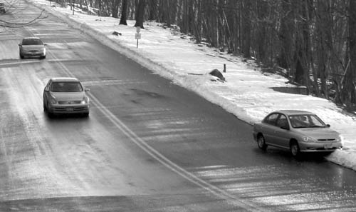
| thanks to everyone for the comments. this shot was taken out of a moving car window. the colors were dull so i converted to b/w. it is certainly not my best shot, but the only one i took in that time frame which conveyed the theme of the contest. |
|
|
|
01/10/2006 07:21:11 PM |
::: Critique Club :::
Hi, I am Kari and from the critique club.
I am to critique your photo "wrong way" as requested.
First Impression - the most important one:
Interesting picture, a little stark and a bit small.
Composition:
The composition is ok. I probably would have worked the broken down car into thirds a little more to make it a bit more of the focus of the picture.
Subject:
Great choice of subject matter. Always and so often happens and all you think is sh!!t .. how did they manage that.
Technical (Colour and light):
The picture appears a little blurry but this may be the depth of field. Also a number of the commentors have mentioned that they like the black and white aspect, but how does it look in colour. I would also work on the resizing options as 640 longest side is going to get a bit more attention (especially in thumbnail) than something smaller.
To grow its vote?:
Solid entry... top 50%. As you practice more with your camera and software you will find more ways to entice people into your picture, and ensuring they have to give it more thought.
Summary:
Well done, keep it up.
If you've got any questions about this critique, please feel free to contact me via the PM system.
Cheers
Kari |
|
Comments Made During the Challenge  |
|
|
01/03/2006 08:27:37 AM |
Nice composition, good timing. Please resize pictures with the longest side as 640 pixels. It will help a lot.
A tiny bit more contrast and sharpness might help too. I find this to be a little on the soft side. |
|
|
|
01/02/2006 01:51:32 PM |
| Wow, Been there, Done this, Live in the Desert now!! Great picture, nice catch. The B&W really makes you focus on the message. Nicely done! |
|
|
|
01/01/2006 11:40:53 PM |
| One of the few entries where it conveys "oops." - point for that. The grayscale looks a bit flat to me. I wonder how this would look with the curves slightly adjusted or more contrast? |
|
|
|
12/28/2005 01:47:56 PM |
| Good catch! B&W works well here. |
|
|
|
12/28/2005 12:28:44 PM |
| black and white is good and compisition, should be a little larger. |
|
Home -
Challenges -
Community -
League -
Photos -
Cameras -
Lenses -
Learn -
Help -
Terms of Use -
Privacy -
Top ^
DPChallenge, and website content and design, Copyright © 2001-2025 Challenging Technologies, LLC.
All digital photo copyrights belong to the photographers and may not be used without permission.
Current Server Time: 03/12/2025 03:03:49 AM EDT.