| Author | Thread |
|
|
01/13/2006 12:34:56 PM |
::: Critique Club ::: [The Saj]
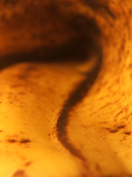
First Impressions: What is it? Okay, interesting line and a pleasant curve....where is the photographer trying to bring me? Do like the curve though....
These were my first initial thoughts. It's a very abstract photo. I am making the assumption that is what you were aiming for? In the future, it is helpful to state a little bit regarding the goals you are aiming for with regards to a photograph. Helps the critiquer out in measuring how well those were achieved.
-------------------------------------------------------------
Composition: I believe the composition for this appeals to the abstract nature quite nicely. Particularly, in how the composition provides a good emphasis of curvature along the brown line. It appears to follow similar curves as Edvard Munch's "Scream"
Subject: As the challenge topic was shape, I am not quite sure this subject was the best choice for conveying such emphasis. The line does clearly denote curvature but the overall feel of the photograph is so strongly abstract that "shape" is not what leaps up to me as a major attribute.
Technical (Colour, focus, and light): The colors in this photograph naturally work well, both are subdued earthtones so they don't leap out at you.
You've mentioned you experimented with varying DOF and did not like how the deeper DOF appeared. I believe the shallow DOF is the better choice if you were looking for a very abstract photo. And I do not believe your composition would have worked well if all was in focus as it would come across as merely a close up photograph of a banana peel.
The lighting seems to have been very natural in it's feel - that is a nice quality.
Creativity: You've created a very nice abstract image from a simple everyday object. That shows a good idea at taking advantage of what is around you.
-------------------------------------------------------------
Summary: I am left with the overall feeling of a nice abstract but a photo that seems a bit out of place in the challenge it was entered. I also feel that the image may not be strong enough to stand on it's own. (Albeit, the nice curvature line reminiscent of "The Scream" is an interesting feature.) I do see this image providing a superb backdrop for incorporation as a graphic design element. Beyond their own artistic merit, these types of abstract imagery are often needed and sought after for album covers, advertisements, etc.
To improve?:
Consider your audience, I believe this photo did not do all that well in the challenge because it was outside the scope of the audience's expectation. It may be or may have "shape" but it didn't convey the concept of "shape" the way most of DPC voters perceived. Had this been submitted in an abstract challenge such as the "Impressionist" challenge a while back - it would have done well.
Another consideration. When I first saw this image and tried to figure out what it was, I was greatly reminded of various representations of "hyperspace" I've seen in such shows as Babylon 5. It might be of interest to play with some "hue" adjustments and see how the results come out.
It is my hope that these insights are helpful, and constructive.
Message edited by author 2006-01-13 12:55:52. |
|
|
|
01/11/2006 09:19:12 PM |
It has shape but looks strange:)
Message edited by author 2006-01-12 12:25:28. |
|
|
|
01/11/2006 04:53:48 PM |
| yeh had a focus problem, put it all in focus and it looks crap, this one looked better for me. More abstract than shapes though your right |
|
Comments Made During the Challenge  |
|
|
01/09/2006 06:29:21 PM |
| Can't tell what this is, folded banana skin? Cotrast could use a boost, and a bit more dof. |
|
|
|
01/08/2006 09:55:53 PM |
| I can see a path, but as for shape, there is too much out of focus for the eye to land on a shape. |
|
|
|
01/07/2006 10:59:42 PM |
| Sorry, but your depth of field is so narrow that only a fraction of the image is in focus. Try shooting with a smaller aperture (larger number f-stop) to widen the focal range. |
|
|
|
01/07/2006 12:38:28 PM |
| disturbing, what is it? Intriguing. |
|
|
|
01/05/2006 09:49:59 PM |
|
|
|
01/05/2006 11:34:03 AM |
| Its cool, but i can't tell what it is, maybe the title should reveal it. |
|
|
|
01/05/2006 11:24:39 AM |
| There is no strong focus point and I am not fond of the yellow cast. |
|
|
|
01/05/2006 09:55:14 AM |
| Looks neat.....what is it?? |
|
|
|
01/04/2006 08:25:11 PM |
| The focus is too soft for me. |
|
|
|
01/04/2006 02:40:37 PM |
| Looks like there could be some really nice shapes but nothing seems to be in focus. 4. |
|
Home -
Challenges -
Community -
League -
Photos -
Cameras -
Lenses -
Learn -
Help -
Terms of Use -
Privacy -
Top ^
DPChallenge, and website content and design, Copyright © 2001-2025 Challenging Technologies, LLC.
All digital photo copyrights belong to the photographers and may not be used without permission.
Current Server Time: 03/12/2025 12:00:18 PM EDT.