| Author | Thread |
Comments Made During the Challenge  |
|
|
01/10/2006 09:52:43 PM |
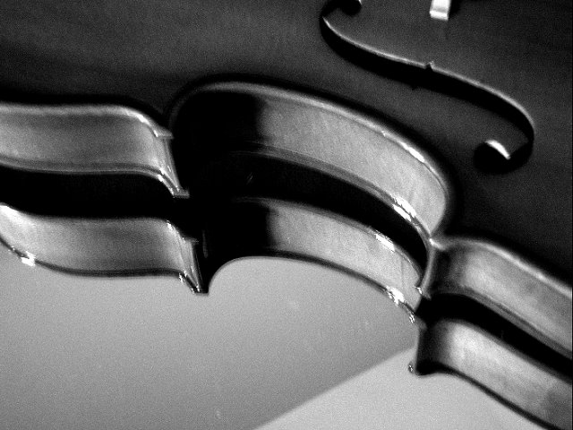
| 3 - Good concept. The 'composition'/placement seems fairly good. Criticism; blurry mainly. Attention also paid to other aspects like the ceiling corners(?)/line reflected in the mirror, the few 'blown'/glare/reflection issues (but hard to control/adjust in basic) and the choice of cropping out part of the 'S' and the white 'something' cropped out (sorry don't know the correct term for it) would all have made this better in my opinion. Not sure that the b&w/toning works in this. |
|
 Photographer found comment helpful. Photographer found comment helpful. |
|
|
01/10/2006 09:25:14 PM |
| This looks way over-processed, and something needs to be in focus. |
|
|
|
01/10/2006 10:16:12 AM |
| Good idea - just not sharp enough |
|
| Photographer found comment helpful. |
|
|
01/09/2006 09:34:22 PM |
| Is it supposed to be that out of focus? |
|
|
|
01/09/2006 12:04:07 PM |
| Consider to use a tripod to avoid blurring images. |
|
| Photographer found comment helpful. |
|
|
01/08/2006 06:22:39 PM |
| The problem with mirrors is that you get two reflective surfaces being the surface of the glass and then the silvering which is on the back. That's cost you here which is a shame. Also the camera shake hasn't made it any kinder |
|
| Photographer found comment helpful. |
|
|
01/08/2006 11:27:52 AM |
| This shot was a little too out of focus for me. I think it would have scored much higher if not for that one element. |
|
| Photographer found comment helpful. |
|
|
01/07/2006 10:59:35 PM |
There's a problem here with camera shake.
Perhaps you could use a shorter exposure time, or a tripod.
A remote shutter-release controller will avoid camera movement during the exposure, too. |
|
| Photographer found comment helpful. |
|
|
01/07/2006 09:03:55 PM |
| unclear other wise would have been good image |
|
| Photographer found comment helpful. |
|
|
01/07/2006 08:58:57 PM |
way too noisy, the cut-out in the top is cut off, the reflection is nice but is not taken advantage of. The bottom shows what I am only guessing is a reflection of the wall and ceiling. The bridge is just seen (or some weird white square).
Violins are beautiful instruments. But I feel this photo doesn't do much to capture that.
However, I am also guessing from the noise that this might have been a P&S. And sometimes it is very hard to transcripe an idea to film |
|
| Photographer found comment helpful. |
|
|
01/07/2006 04:14:13 PM |
| focus needs to be sharper |
|
|
|
01/07/2006 09:32:50 AM |
| Good idea, but lack of sharpness - 6 |
|
|
|
01/05/2006 09:08:58 PM |
| too blury, unless that is what you where going for. |
|
|
|
01/05/2006 11:33:08 AM |
|
|
|
01/05/2006 11:23:46 AM |
| This was a great idea for the topic, and I can't imagine what went wrong with your focus, unless of course the OOF was intentional, then it was a poor idea. |
|
| Photographer found comment helpful. |
|
|
01/05/2006 09:04:34 AM |
| Very pretty but almost seems a little out of focus.......still very nice shot |
|
| Photographer found comment helpful. |
|
|
01/05/2006 04:28:21 AM |
|
|
|
01/05/2006 03:16:17 AM |
| Would have been bliss if it hadn't been grainy, in my opinion (although it looks as though you did the grain on purpose -- just my personal preference). What a great idea and good composition. Clever title too. ;) |
|
| Photographer found comment helpful. |
|
|
01/04/2006 09:36:54 PM |
| Being in focus would have made this a better photo. |
|
| Photographer found comment helpful. |
|
|
01/04/2006 06:23:47 PM |
| very soft focus - neither subject nor reflection are sharp, maybe a higher aperture value would have been better |
|
| Photographer found comment helpful. |
|
|
01/04/2006 02:43:59 PM |
| nice shapes. don't even mind that it's blurry a bit. but my eye keeps trying to figure out what that shadow is underneith it. |
|
| Photographer found comment helpful. |
|
|
01/04/2006 01:31:31 PM |
|
| Photographer found comment helpful. |
|
|
01/04/2006 08:33:48 AM |
| Nice composition, obviously, it would be improved with better focus and less grain. Also, I think the diagonal line in the background hurts more than it helps. |
|
| Photographer found comment helpful. |
|
|
01/04/2006 05:57:42 AM |
| for me its all out of focus |
|
| Photographer found comment helpful. |
|
|
01/04/2006 04:19:29 AM |
| Nice idea but spoiled for me my by the lack of cleanm focus and the artefacts - is it compressed too much? |
|
| Photographer found comment helpful. |
|
|
01/04/2006 03:26:04 AM |
|
| Photographer found comment helpful. |
Home -
Challenges -
Community -
League -
Photos -
Cameras -
Lenses -
Learn -
Help -
Terms of Use -
Privacy -
Top ^
DPChallenge, and website content and design, Copyright © 2001-2025 Challenging Technologies, LLC.
All digital photo copyrights belong to the photographers and may not be used without permission.
Current Server Time: 03/12/2025 07:42:39 AM EDT.