| Author | Thread |
|
|
01/15/2006 03:24:27 PM |
::: Critique Club ::: [The Saj]
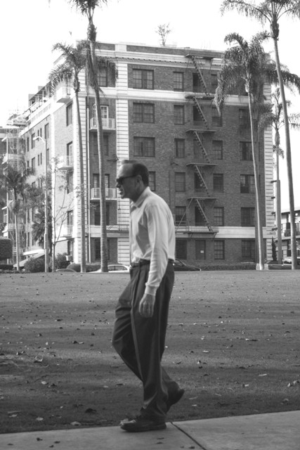
First Impressions: I am back in San Diego....(or some place that feels very close). At first glance this photo shouts potential but I feel there are several elements that just hold it back. It could have been a suberb era shot.
-------------------------------------------------------------
Composition: I really like the placement of the building. The angle, etc. However, I am unsure of the crop regarding the tree. Secondly, I feel as if the man was shot a moment too late. If he was an inch or so closer to the right so as to be stepping "into" the frame.
Subject: The pose and expression on the foreground subject is excellent. It has made a good capture of that age of retirement (but not yet elderly). The gentlemen's shirt and pants match the white and dark colors of the building quiet nicely. The building also is interesting; from it's place of the fire escape, white porches and white stone trim. Provides a very strong secondary subject.
Technical (Colour, focus, and light): This is the second area that I feel this photo takes a major hit on. THe sky is blown out and over exposed. Even in B&W this is exceedingly noticeable by the loss of detail in the white washed trees. Focus could be a little sharper on the man in front. But that can be difficult with very wide angle shots.
-------------------------------------------------------------
Summary: Overall it was a nice capture. Has a very antiquated feel which adds a lot of character to the photo. However, the handful of technical & compositional issues prevent this shot from reaching it's full potential. I very much like the choice in subjects. And I think capturing the main subject in mid-step was done very well.
To improve?: Be mindful of over-exposure. It's far easier to enhance detail that is already in the photo. It's near impossible to bring it out when it's been washed. Just be mindful of your sky exposures in the future.
-------------------------------------------------------------
It is my hope that these insights are helpful, and constructive. If you have any questions
regarding this critique, please feel free to PM me.
- Jason "The Saj" |
|
Comments Made During the Challenge  |
|
|
01/10/2006 11:24:45 PM |
| if you'd have cropped him so he is on the right hand thirds line, you'd have a winner there |
|
|
|
01/10/2006 07:27:41 AM |
| It looks like it was taken in the 30's. Perhaps a little more contrast would have given the depth needed |
|
|
|
01/09/2006 06:12:13 PM |
| poor contrast, but an ok take on the challenge. |
|
|
|
01/09/2006 05:04:27 PM |
| An interesting photo. I think it is a bit overexposed, the brightness of the sky blurs out the tops of the buildings and the rest of the photo has very low contrast. Nice composition. |
|
|
|
01/08/2006 12:35:32 PM |
| the man is slightly out of focus meanwhile the background is sharp. |
|
|
|
01/06/2006 08:31:39 PM |
| Not too interesting; it seems very "staged." |
|
|
|
01/06/2006 04:34:48 PM |
| Like the sense of windiness and arrested motion, perspective is kind of flat though |
|
|
|
01/06/2006 12:53:16 PM |
| Hi. What is he encumbered by, besides his thoughts? Desat was a good choice, IMO. |
|
|
|
01/05/2006 10:50:56 PM |
| I like the vintage look to this photo, but the composition leaves much to be desired. |
|
|
|
01/05/2006 02:35:07 PM |
| could use more contrast and the sky is blown out. but i like the title and if def. meets the challenge |
|
|
|
01/05/2006 04:21:00 AM |
|
|
|
01/04/2006 10:42:21 PM |
| Liked the black and white. Thought it could have been more contrasty with richer blacks and whiter whites. This one had too many midtones. Thought it could have been more focused as well. |
|
|
|
01/04/2006 09:57:12 PM |
| put him in a black suit and that guy is agent smith. |
|
|
|
01/04/2006 07:56:08 PM |
| His face being in line with the white stripe, and the balcony railing at his mouth are distracting to me. |
|
|
|
01/04/2006 06:38:04 PM |
|
|
|
01/04/2006 01:03:48 PM |
| He needs to be sharper and the background less sharp (thinking decreased DOF here) to de-emphasize the busy building in the background. |
|
|
|
01/04/2006 09:11:33 AM |
| has a classic feel - very interesting - 7 |
|
Home -
Challenges -
Community -
League -
Photos -
Cameras -
Lenses -
Learn -
Help -
Terms of Use -
Privacy -
Top ^
DPChallenge, and website content and design, Copyright © 2001-2025 Challenging Technologies, LLC.
All digital photo copyrights belong to the photographers and may not be used without permission.
Current Server Time: 03/12/2025 09:30:03 AM EDT.