| Author | Thread |
|
|
01/12/2006 07:01:50 AM |
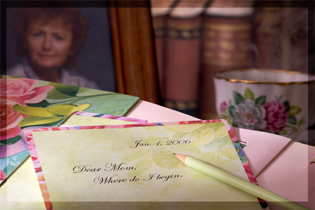
Greetings from the Critique Club. After reviewing the photo I have some suggestions and some comments.
Challenge met, good representation of Mother this is a nice emotive photo. Good use of DOF to add to your presentation.
The color seems a bit flat, perhaps bump the saturation, and the contrast a little to help make things stand out. The photo seems a little busy, I might have taken the books and the cup out of the photo and left some empty space to help draw the attention to the photo and the letter. I think the letter being printed and then having a pencil in the photo takes away, I would have liked to have seen a Pen and handwritten, or if you used the pencil the writing to be in pencil. Overall a good entry. Good luck with future challenges. |
|
 Photographer found comment helpful. Photographer found comment helpful. |
Comments Made During the Challenge  |
|
|
01/08/2006 12:06:47 AM |
| How many of us have been there..... I like that this photo makes me think... what would I put in that letter, |
|
| Photographer found comment helpful. |
|
|
01/06/2006 02:07:50 AM |
| im not crazy about the border you added, i love all the colors in this shot though |
|
| Photographer found comment helpful. |
|
|
01/05/2006 08:05:39 PM |
| I like this. Nice DOF. Very creative |
|
| Photographer found comment helpful. |
|
|
01/05/2006 01:56:15 PM |
| I think it would have been more powerful if the writing was done by hand. This looks too "staged". Generally I don't prefer pictures where words are the subject or important to the meaning. Just a personal preference I guess. |
|
| Photographer found comment helpful. |
|
|
01/05/2006 08:02:00 AM |
| Something bugs me about this and I haven't worked out what but I kind of like it too. A little cluttered perhaps? Maybe the fact that Dear Mom is done on the computer and not the pencil in shot? I'll work on it |
|
| Photographer found comment helpful. |
|
|
01/04/2006 10:17:28 PM |
|
| Photographer found comment helpful. |
|
|
01/04/2006 01:31:20 PM |
|
| Photographer found comment helpful. |
|
|
01/04/2006 02:17:03 AM |
| Very emotive image. Colorful, bordering on being busy, but presented well. Great use of dof. I am drawn into the image, wondering what it is that will be said in the letter. Very nice. And that is wonderful writing. Was that really hand written??? :-) Good overall, I'm not crazy about the transparent border, in this case it seems to be a bit distracting. Maybe a small solid border could work? Nice job. |
|
| Photographer found comment helpful. |
|
|
01/03/2006 10:09:44 PM |
|
| Photographer found comment helpful. |
|
|
01/03/2006 08:46:48 PM |
| Composition is ok. The choice of subject matter is ok. Nice image quality. Very creative! - 5 |
|
| Photographer found comment helpful. |
|
|
01/03/2006 10:47:45 AM |
| great idea but its lacking a little spark. I also find it strange that the letter appears to be typed and there's a pencil on it... should have been hand written imho. |
|
| Photographer found comment helpful. |
|
|
01/02/2006 11:15:13 PM |
| Nice set-up and composition. |
|
| Photographer found comment helpful. |
|
|
01/02/2006 09:57:05 PM |
| I like the idea for this shot. Overall, it looks quite nice. I would much rather have seen the card handwritten, though. Having it machine-printed takes away from the realism, esp with the pencil. |
|
| Photographer found comment helpful. |
|
|
01/02/2006 09:40:41 PM |
| I like the way the picture focuses in on the letter.. but I find it a bit strange to read the typewritten words and having the pencil lying there. The words you've chosen leave a lot of room for interpretation by the viewer too. |
|
| Photographer found comment helpful. |
|
|
01/02/2006 09:40:26 PM |
|
| Photographer found comment helpful. |
|
|
01/02/2006 09:02:52 PM |
|
| Photographer found comment helpful. |
|
|
01/02/2006 05:32:24 PM |
| wow ...sounds like a juicy story here! nice image good DOF good colours |
|
| Photographer found comment helpful. |
|
|
01/02/2006 03:31:42 AM |
| seems odd to me to have a pncil in the farme when the letter has been printed... |
|
| Photographer found comment helpful. |
|
|
01/02/2006 03:07:03 AM |
| I like the way you composed this image. The blurred photograph in the background adds so much impact to this image. |
|
| Photographer found comment helpful. |
|
|
01/02/2006 02:11:41 AM |
| since the pencil is there, i would have preferred the writing be in pencil too. or put a pen to give the impression it was written, rather than printed out as it appears now. nice concept and good colors. |
|
| Photographer found comment helpful. |
Home -
Challenges -
Community -
League -
Photos -
Cameras -
Lenses -
Learn -
Help -
Terms of Use -
Privacy -
Top ^
DPChallenge, and website content and design, Copyright © 2001-2025 Challenging Technologies, LLC.
All digital photo copyrights belong to the photographers and may not be used without permission.
Current Server Time: 03/12/2025 02:42:36 PM EDT.