| Author | Thread |
Comments Made During the Challenge  |
|
|
06/30/2002 10:38:00 PM |
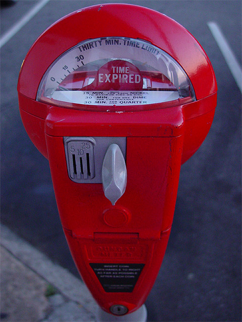
| Nice vibrant red -- seems you need more dof to have the bottom of the meter in focus as well. |
|
|
|
06/30/2002 06:21:00 PM |
|
|
|
06/30/2002 05:01:00 PM |
| I like this composition a lot but the colors seem a little dim -- not as vibrant as they could be and even a little blue. I'd love to see that meter as teh bright candy apple red color it appears to be. |
|
|
|
06/30/2002 03:55:00 AM |
| very cool--i just like this! 9--amitchell |
|
|
|
06/29/2002 08:55:00 PM |
| City life in a nutshell. Flawless execution. |
|
|
|
06/29/2002 10:27:00 AM |
| Yep, seen plenty of these in the city. |
|
|
|
06/28/2002 07:44:00 PM |
Well executed shot. Joke time: No car, no pay - Be a pal, put up a nickle for the poor slob. Seriously, your shot is perfectly framed and focused. It's a bit dull. Suggestions for the dullness - see your reflection in the glass? try it in a location where YOU show up better in that reflection, or shoot with a car in the spot and ask a friend to hold up a ticket sized paper, out of focal range, towards the car (suggesting the receipt of a ticket, ha,ha) or with the paper visible on the windshield.
Get the idea? Have fun, make it fun for the viewer, too! Photo 9 City 7 Total 8 |
|
|
|
06/28/2002 12:19:00 AM |
| i like the photo, and the message |
|
|
|
06/26/2002 02:30:00 PM |
| Becasue of the white lines in the background, and teh sidwalk on the lower left, I think a different angle would have served this picture better. The use of the color red is very effective, though at making the shot stand out. |
|
|
|
06/25/2002 09:56:00 PM |
| Wow! It looks like fire candy! |
|
|
|
06/25/2002 03:00:00 PM |
| God, I hate those things. I"m confused about the pricing though..does that actually say: 30 mins for one dime (for your convenience) and then it says 30 mins for one quarter? Wish the city I lived in was so nice. Our meters don't even ACCEPT dimes or nickels. Good shot. Great use of aperature. |
|
|
|
06/25/2002 02:09:00 PM |
|
|
|
06/25/2002 12:28:00 PM |
| very nice. just a tad off center which detracts a bit from the overall feeling. but a great interpretation of the challenge and a well done shot. love the red contrast with the dull background. nicely done. |
|
|
|
06/25/2002 10:02:00 AM |
| Simple. Great Focus. Perfect color saturation. |
|
|
|
06/25/2002 09:42:00 AM |
| I like this. Would a polarized lens take care of the reflection/glare off the glass? Would be great if there was a car in the spot...an old beater or a jag, can't decide. Could be a little brighter. 7 |
|
|
|
06/24/2002 07:36:00 PM |
| Original idea. I like it! |
|
|
|
06/24/2002 06:23:00 PM |
| Cleanest parking meter I've seen for quite some time. A bit dark, but nice and clear. |
|
|
|
06/24/2002 06:03:00 PM |
| Clever - great expression here. I'm sure there are a lot of people that can relate to this. Terrific!! |
|
|
|
06/24/2002 01:02:00 PM |
| Awesome work, great job. Love it all. Kee |
|
|
|
06/24/2002 12:17:00 PM |
| If there was a parking meter within 100 miles of me, I would have tried to photograph it for this challenge also :) I would have also looked for some really cool angle other than straight on. I may have laid on my back on the ground and photographed someone putting money in it... :) good shot! = 7 -jmsetzler |
|
|
|
06/24/2002 12:03:00 PM |
| Good color. Not sure if you have any more control over depth of field, but if so maybe try blurring the back ground a little more. If not.. ignore that. I still think it's a good shot either way. |
|
|
|
06/24/2002 11:52:00 AM |
| nice color. I would have made the back mor blurry... |
|
Home -
Challenges -
Community -
League -
Photos -
Cameras -
Lenses -
Learn -
Help -
Terms of Use -
Privacy -
Top ^
DPChallenge, and website content and design, Copyright © 2001-2025 Challenging Technologies, LLC.
All digital photo copyrights belong to the photographers and may not be used without permission.
Current Server Time: 03/12/2025 12:50:48 PM EDT.