| Author | Thread |
|
|
02/20/2006 05:30:27 PM |
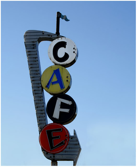
pop up the contrast, a little more saturation, and more even spacing between top and bottom. would have been 5.7 or so then.
|
|
 Photographer found comment helpful. Photographer found comment helpful. |
Comments Made During the Challenge  |
|
|
02/06/2006 02:06:51 PM |
| Nice clean shot. I think a bit more space underneath the bottom arrow would have been better. |
|
| Photographer found comment helpful. |
|
|
02/04/2006 09:57:19 AM |
| I love the colors in this old retro sign, but the lower edge of sign is cropped off. I think a tighter crop to the left or right or even the sign shot from a different angle could give the image more impact. |
|
| Photographer found comment helpful. |
|
|
02/03/2006 09:46:09 PM |
| I love the title ... no wait .. i love the photo. Great sign. |
|
| Photographer found comment helpful. |
Home -
Challenges -
Community -
League -
Photos -
Cameras -
Lenses -
Learn -
Help -
Terms of Use -
Privacy -
Top ^
DPChallenge, and website content and design, Copyright © 2001-2025 Challenging Technologies, LLC.
All digital photo copyrights belong to the photographers and may not be used without permission.
Current Server Time: 03/15/2025 04:15:36 AM EDT.