| Author | Thread |
|
|
05/25/2010 02:56:31 PM |
| I was wondering what I scored this and then noted it was before I joined DPC. I think this is fabulous. |
|
 Photographer found comment helpful. Photographer found comment helpful. |
|
|
01/20/2006 09:53:05 PM |
| I thought this may have placed higher - top 5 at least. I liked it and gave it a 9. Still a great shot in my book. |
|
| Photographer found comment helpful. |
|
|
01/17/2006 09:55:43 AM |
I agreee with posthumous.
Sell it to 'em anyway. |
|
| Photographer found comment helpful. |
|
|
01/16/2006 09:53:35 AM |
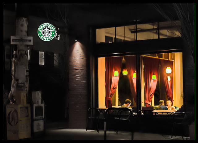
| I gave you an 8 for this one. I caught the painting reference and appreciated it. The addition of the Starbucks logo is an hilarious bit of irony. |
|
| Photographer found comment helpful. |
|
|
01/16/2006 08:26:36 AM |
| Contact Starbucks; this should be hanging in every one. I love the feeling from this capture. |
|
| Photographer found comment helpful. |
|
|
01/16/2006 02:04:07 AM |
| This is great. Congratulations on a fine image, top 20, and making it into my favorites ;) |
|
| Photographer found comment helpful. |
|
|
01/16/2006 01:47:19 AM |
| Love this one Doc! Should have placed higher for sure...I love the "homage " |
|
| Photographer found comment helpful. |
|
|
01/16/2006 01:04:28 AM |
I love the mood that this image imparts. Perhaps its beauty is too subtle for those seeking fireworks. Most beauty is not fiery.
Message edited by author 2006-01-16 01:09:11. |
|
| Photographer found comment helpful. |
|
|
01/16/2006 12:55:33 AM |
| this should have finished MUCH higher! my fav of the challenge. you should work this up as a print! |
|
| Photographer found comment helpful. |
|
|
01/16/2006 12:51:59 AM |
|
| Photographer found comment helpful. |
|
|
01/16/2006 12:14:57 AM |
|
| Photographer found comment helpful. |
|
|
01/16/2006 12:12:04 AM |
| Good placement, but I thought should have been higher. Either way this is a great pic....very depthy and very well composed. |
|
| Photographer found comment helpful. |
|
|
01/16/2006 12:09:49 AM |
| Congradulations on a strong finish, Doc. It is a wonderful image. |
|
| Photographer found comment helpful. |
Comments Made During the Challenge  |
|
|
01/15/2006 09:31:29 PM |
| it's like the painting in a modern-updated way. very-well done |
|
| Photographer found comment helpful. |
|
|
01/15/2006 09:09:42 PM |
| I love the color rendition in this image. A Starbucks propaganda or a scene reminscent of the old movies with James Dean? |
|
| Photographer found comment helpful. |
|
|
01/15/2006 07:53:06 PM |
| Simple mundane scene, but I like it. |
|
| Photographer found comment helpful. |
|
|
01/15/2006 07:41:11 PM |
Ala Gottfried Helnwein? Try Edward Hopper. Helnwein did a painting that IMO, completely ripped off the original masterpiece known as "Nighthawks" by Edward Hopper...look here to see what I am talking about...enough of the art history lesson. About the image...ya did good! I immediately thought of "Nighthawks" when I saw this...{BTW "Nighthawks" is my ALL TIME favorite painting ever...I used to go to the Art Institure and just ponder it for lengthy amounts of time..so I'm strange, perhaps thats why I'm slighty offended you have given credit to Helnwein.} Anyway, I do like this image alot, the warmth of the indoor light contrasted against the cold light outdoors, then again I am biased in a sense. My only "dislikes", and these are only my opinions, really are the Strabucks sign...kinda makes this seem a bit like, well...an advert. for Starbucks IMO...perhaps try one where you have cloned that sucker out? Also, the image seems a tad overboard with it use of some sort of noise reduction/smoothing? It seems that there should be a bit more texture/definition happening with the brick and the utility pole...esp. when compared to that crispy Starbucks sign. Other than that I think this is super nice.
Post PM: I'm glad to see you know the original...but knowing what I know now...it's kind of a silly reason (IMO) to use the Helnwein shout out just for the sake of the title..."Boulevard of Java Dreams" would have been just fine on it's own...AND...you wouldn't have been subjected to this insanely long comment !
: } |
|
| Photographer found comment helpful. |
|
|
01/15/2006 02:40:43 PM |
| I'm a sucker for available light. This is very nice. 8 |
|
| Photographer found comment helpful. |
|
|
01/15/2006 02:28:58 AM |
| Amazing photo, it reminds me of that poster... |
|
| Photographer found comment helpful. |
|
|
01/15/2006 01:37:19 AM |
| Gee I wish that'd been in Coffee, it's brilliant |
|
| Photographer found comment helpful. |
|
|
01/15/2006 12:36:42 AM |
| I really like this scene you've captured. It has a great urban and candid feel to it. IMHO I would have liked to see the Starbucks sign desaturated as well since I think the windows create an intersting enough subject to be the focal point here. the focus ins some areas also seems a bit soft for my tastes. Just my opinion, nice shot nonetheless.... 8 |
|
| Photographer found comment helpful. |
|
|
01/15/2006 12:12:53 AM |
|
| Photographer found comment helpful. |
|
|
01/14/2006 04:10:58 PM |
| Very Edward Hopper-esque...I like the moodiness of this. This wasn't the type of shot I envisioned for "A Burst of Color" but I can't argue that there are colorful (if subdued color) elements in an otherwise neutral background. I just noticed the title. I will have to look up Gottfriend Helnwein. |
|
| Photographer found comment helpful. |
|
|
01/14/2006 02:21:17 PM |
|
| Photographer found comment helpful. |
|
|
01/14/2006 08:43:25 AM |
| reminds me of Edward Hopper - like the ambience - striking |
|
| Photographer found comment helpful. |
|
|
01/13/2006 11:49:19 PM |
| Very nice image... I am strugelling with different exposure requiring shots like this. You have exposed inside and outside perfectly. I could use some advice. |
|
| Photographer found comment helpful. |
|
|
01/13/2006 09:59:05 PM |
| reallu interesting photo... colors great and the composition really caught my eye |
|
| Photographer found comment helpful. |
|
|
01/13/2006 07:11:52 PM |
| This is awsome. Nice Job. |
|
| Photographer found comment helpful. |
|
|
01/13/2006 01:21:04 PM |
| Nice shot. Like the way the starbuck's light panel stands over the background. IMO inside the local the girl is a bit overexposed. 7 |
|
| Photographer found comment helpful. |
|
|
01/12/2006 08:57:29 PM |
| To me, this is reminiscent of that poster you often see of James Dean, Hunphry Bogart and Marilyn Monroe in a diner. Would I like it more without the Starbucks sign? Maybe just a little. Here's a 9 for you. |
|
| Photographer found comment helpful. |
|
|
01/12/2006 04:27:38 PM |
|
| Photographer found comment helpful. |
|
|
01/12/2006 04:27:30 PM |
| Great light! Interesting image has lots of nice elements. |
|
| Photographer found comment helpful. |
|
|
01/11/2006 10:52:24 AM |
| perfect framing, excellent lighting, good sharpness.. what more could we need! that's a 10 |
|
| Photographer found comment helpful. |
|
|
01/10/2006 04:24:10 PM |
| I love how all the different light sources here are so nicely balanced, with nothing too over or underexposed. Very good interpretation of the challenge, too. |
|
| Photographer found comment helpful. |
|
|
01/09/2006 10:07:15 PM |
| It's a wonderful, crisp shot. Great lighting. My only concern is that the challenge would make me think that the starbucks sign is the subject (with the matching green border). However, the people inside seem like a much more interesting subject for the picture. Either way, very nicely done! |
|
| Photographer found comment helpful. |
|
|
01/09/2006 06:31:32 PM |
| now this is an outstanding image! fits the challenge perfectly. i could see this as a huge print. reminds me of the "Nighthawks" painting by Edward Hopper. this should take a ribbon. |
|
| Photographer found comment helpful. |
|
|
01/09/2006 05:08:26 PM |
| Great job, really fits the challenge well. |
|
| Photographer found comment helpful. |
|
|
01/09/2006 12:06:46 PM |
| Nice (more) modern version of Nighthawks. Color-wise a bit muted, but the warm light does burst out into the dark street. Perhaps a bit too much neat-image? Nicely composed. Very pleasant to look at. |
|
| Photographer found comment helpful. |
|
|
01/09/2006 09:45:56 AM |
| Too bad all the newspaper racks and poles make it the photo too noisy. Otherwise nice composition and good focus, and a nice light tone. |
|
| Photographer found comment helpful. |
|
|
01/09/2006 03:32:20 AM |
| Such a wonderful composition. I think you nailed the exposure. A great entry for this challenge. Revisiting...bumping up. |
|
| Photographer found comment helpful. |
|
|
01/09/2006 01:41:58 AM |
| To me, this suits the challenge perfectly. That one spot of POW amidst the drabness of tones in the rest of the shot. To be honest, I wish the green and white Starbucks sign weren't there, it distracts a bit for me. 8 |
|
| Photographer found comment helpful. |
|
|
01/09/2006 12:41:08 AM |
| Outstanding! This should make the front page. Very cool! |
|
| Photographer found comment helpful. |
Home -
Challenges -
Community -
League -
Photos -
Cameras -
Lenses -
Learn -
Help -
Terms of Use -
Privacy -
Top ^
DPChallenge, and website content and design, Copyright © 2001-2025 Challenging Technologies, LLC.
All digital photo copyrights belong to the photographers and may not be used without permission.
Current Server Time: 03/12/2025 07:57:37 PM EDT.