| Author | Thread |
Comments Made During the Challenge  |
|
|
01/17/2006 10:18:28 PM |
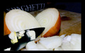
| Looks like that's going to be some good borscht |
|
|
|
01/17/2006 10:17:54 PM |
|
|
|
01/17/2006 08:51:05 PM |
| I think I'd like this better if the empty pan with the stained bottom and the little glass dish of butter were not in it. I like the colors very much and the soft focus is a very nice touch - good job :) |
|
|
|
01/17/2006 01:36:00 AM |
| Mmmmmm. Looks like soup to me! I like the dreamy haze to this. So many other entries have to harsh of lighting but this is nice comp and color. |
|
|
|
01/17/2006 12:05:07 AM |
|
|
|
01/16/2006 05:53:55 PM |
| Composition and perspective are fine. Nothing is overexposed. The contrast is a little weak and there appears to be a distracting lighting effect just to the left of the pan at the top. The stain on the bottom of the pan does not add much positive to the overall effect. |
|
|
|
01/14/2006 11:55:47 PM |
| The lighting doesn't really bring the subject to life. The pot, too, seems to just have been forced into the shot, likely to imply that the vegetables would soon be prepared; it doesn't really seem to have a place in the picture. |
|
|
|
01/14/2006 10:52:36 PM |
|
|
|
01/13/2006 01:19:43 PM |
| I like the picture; it might have benefitted a bit from some adjustments to saturation to make the colors pop out a bit more. |
|
|
|
01/12/2006 06:20:23 PM |
|
|
|
01/12/2006 12:46:13 PM |
| bonus for natural light, it's the only light that's good enough to eat! |
|
|
|
01/11/2006 07:06:47 PM |
| Could have used a little more contrast. Also, there seems to be a weird beam of light right through the vegetables. |
|
|
|
01/11/2006 07:02:36 PM |
| Love it!! Love Borscht..beautiful simple colours well executed! |
|
|
|
01/11/2006 05:15:42 PM |
| I don't like the lighting, too foggy looking. |
|
|
|
01/11/2006 04:15:16 PM |
| colors are a bit washed out |
|
|
|
01/11/2006 02:46:41 PM |
| Not fond of the lighting, some sort of odd glow in the photo. |
|
|
|
01/11/2006 02:54:11 AM |
| Yummmm, borscht. Little soft focus. Hey, where's the dill? |
|
|
|
01/11/2006 01:17:26 AM |
| good concept, but lighting quality could be improved. It looks like there is a lens flare in the top. |
|
Home -
Challenges -
Community -
League -
Photos -
Cameras -
Lenses -
Learn -
Help -
Terms of Use -
Privacy -
Top ^
DPChallenge, and website content and design, Copyright © 2001-2025 Challenging Technologies, LLC.
All digital photo copyrights belong to the photographers and may not be used without permission.
Current Server Time: 03/13/2025 05:28:30 AM EDT.