| Author | Thread |
Comments Made During the Challenge  |
|
|
01/16/2006 07:53:57 AM |
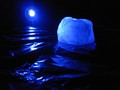
| Scary, but has too much table for me |
|
|
|
01/15/2006 08:00:57 AM |
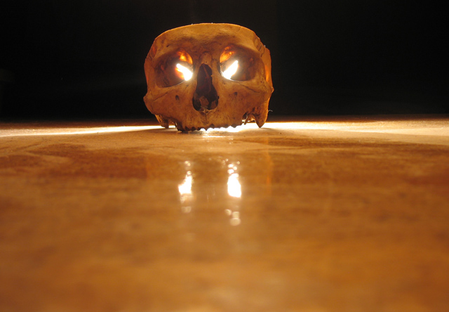
| Maybe a bit too much of the floor here. I think a greater majority of the black background would have made the skull stand out more. Also the fact that it is not quite centred is distracting. |
|
|
|
01/13/2006 07:56:05 PM |
|
|
|
01/13/2006 06:21:50 PM |
| Unique angle for this shot. The light seems a bit too bright for me, but it does make for an angry looking expression. |
|
|
|
01/12/2006 04:31:17 PM |
|
|
|
01/12/2006 01:50:39 AM |
|
|
|
01/11/2006 10:12:38 AM |
| Cool, but way too much out of focus dead space in front. |
|
|
|
01/11/2006 06:50:12 AM |
|
Home -
Challenges -
Community -
League -
Photos -
Cameras -
Lenses -
Learn -
Help -
Terms of Use -
Privacy -
Top ^
DPChallenge, and website content and design, Copyright © 2001-2025 Challenging Technologies, LLC.
All digital photo copyrights belong to the photographers and may not be used without permission.
Current Server Time: 03/12/2025 09:54:16 AM EDT.