| Author | Thread |
|
|
01/30/2006 02:14:11 PM |
Hello from the Critique Club!
I have studied your image and have the following to offer:
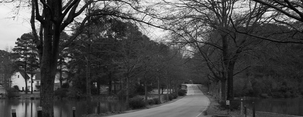
Composition/perspective - the overall scene here is very pleasing to look at, but could have a lot more impact. The crop to make it wide leans the image more towards a landscape (see below) and takes away focus and strength from your subject, the road. A narrower crop would have allowed for an overall larger image (closer to 640x640) which also would make the road more prominent in the shot and placed better to the rule of thirds. I think this also would help with the lack of foreground in the shot. The road appears to come out of nowhere and when you follow it you are immediately in water which opens the scene up as the next thing you are led to is the shore. Again, this takes away from the subject as one naturally follows the shoreline across the scene and focus is lost on the subject as the main element.
Color - black and white obviously. But overall I think slightly different processing would make it stand out more and give the individual elemnts more presence. It is very gray. Some more adjustment with contrast and perhaps levels would help separate the abundance of similar shades.
Lighting - natural and well controlled in the shot. There appears an even cast over the whole scene. The sky is not blown out at all and there are no flares or bright spots.
Challenge requirements - this meets the challenge in the sense that it does have a road. However, it leans closer to being a landscape. A stronger presence of the road in the shot to make it the center of attention would have made it a much stronger contender. This could have been achieved a number of ways - crop being one, different zoom/camera angle.
Overall/my opinion - as stated above this is a very pleasing scene to look at. I think it needs work on the processing end to give it more contrast. Would be interesting to see a color version. The road is very centered in the shot. What saves this is the width and the fact the road, although the subject, does not seem a major element. A different crop to offset it some to get closer to the rule of thirds would eliminate this. |
|
 Photographer found comment helpful. Photographer found comment helpful. |
Comments Made During the Challenge  |
|
|
01/23/2006 10:00:36 PM |
| photo is somewhat small. hard to see the details. |
|
| Photographer found comment helpful. |
|
|
01/21/2006 05:22:57 AM |
| The crop here feels very drastic. I find myself wanting to look 'under' the photo. I think it needs some foreground. |
|
| Photographer found comment helpful. |
|
|
01/19/2006 05:27:55 PM |
| I'm liking the crop. Looks like familar towns everywhere! |
|
| Photographer found comment helpful. |
|
|
01/19/2006 01:00:41 PM |
| Nice presentation. Removing forground brings the subject forward. |
|
| Photographer found comment helpful. |
Home -
Challenges -
Community -
League -
Photos -
Cameras -
Lenses -
Learn -
Help -
Terms of Use -
Privacy -
Top ^
DPChallenge, and website content and design, Copyright © 2001-2025 Challenging Technologies, LLC.
All digital photo copyrights belong to the photographers and may not be used without permission.
Current Server Time: 03/12/2025 08:09:25 AM EDT.